Head Of Product
As the product designer on Qetae app, I mainly…
- Owned the product design end to end, from early discovery to defining the core customer flows for services, parts, and delivery
- Spoke directly with 9 stakeholders, garage owners, vehicle owners, to understand how they actually run their businesses, where things break down, and what slows them down day to day
- Used those conversations to shape the marketplace experience, balancing what car owners need with what shops can realistically support
there’s no simple way to discover garages or car part shops online. Information is scattered, often outdated, or missing altogether, which forces people to rely on word of mouth, phone calls, or visiting multiple places in person. Even basic decisions end up taking more time than they should.
Most garages don’t have clear online listings, making it hard to understand their services, location, or reputation before visiting.
Parts availability and pricing are rarely visible online, forcing people to call or visit multiple shops to find what they need.
Finding a garage, buying parts, and arranging delivery happen in separate places, creating unnecessary back-and-forth.
We mapped out the full interview flow ahead of time so each conversation stayed focused and aligned with what we were trying to learn.
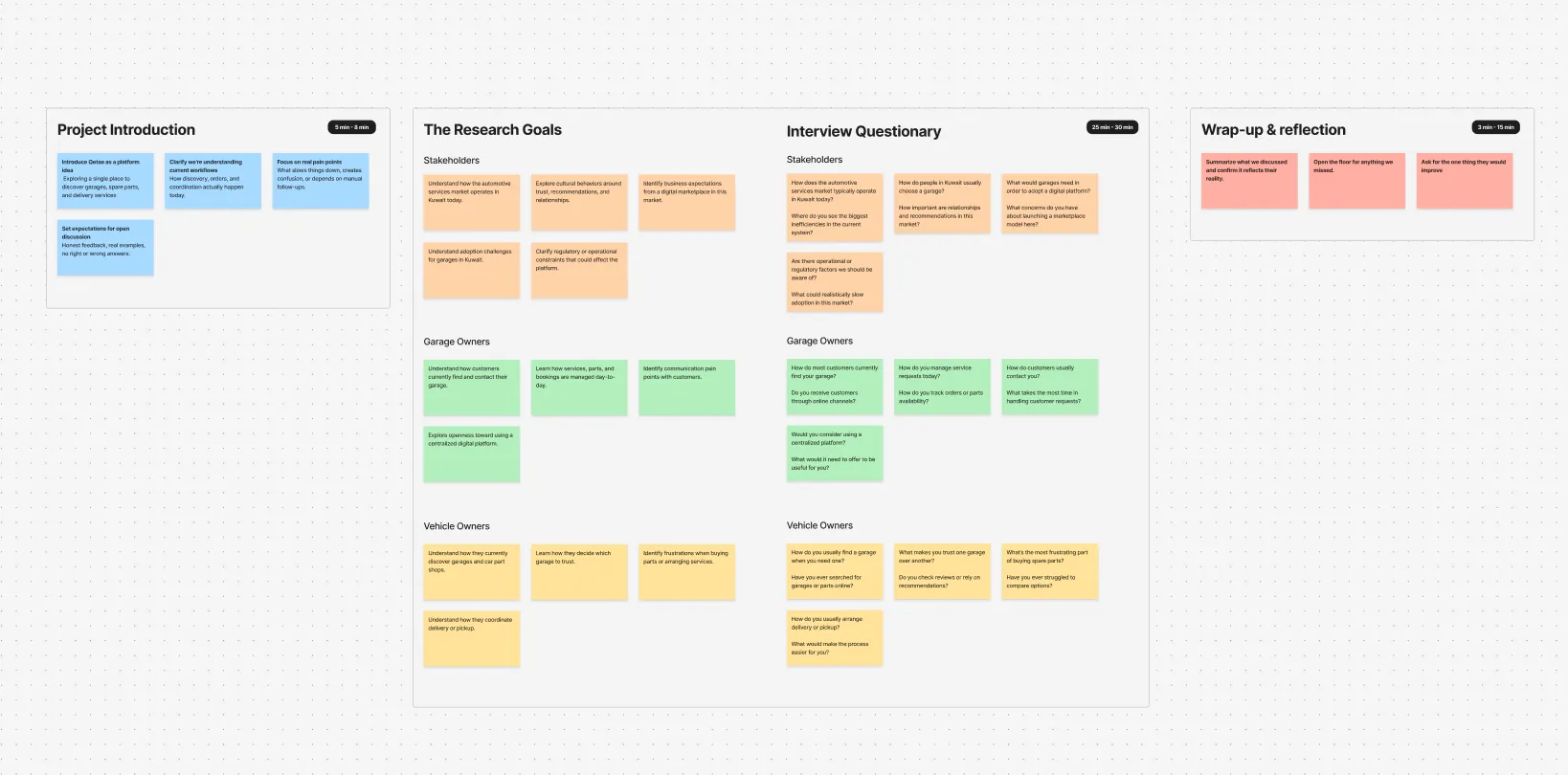
In three focus groups, we noticed that certain concerns kept showing. The points below really capture what participants brought up the most and helped us see where the biggest gaps are.
"Most of the customers come through word of mouth. shops don't really exist effectively online."
"People usually call just to ask what services we offer. That information isn’t clearly available anywhere."
"If someone needs a specific part, they have to call three or four shops to compare prices."
"We get messages on WhatsApp all day instead of proper service requests."
"Customers don’t know which garage to trust unless a friend recommends it."
"Sometimes drivers show up without full details, and we have to clarify things over the phone."
After wrapping up the research, the next step was turning everything we heard into direction. Instead of treating interviews as isolated feedback, we looked for patterns that could guide how the product should feel, behave, and prioritize tasks.

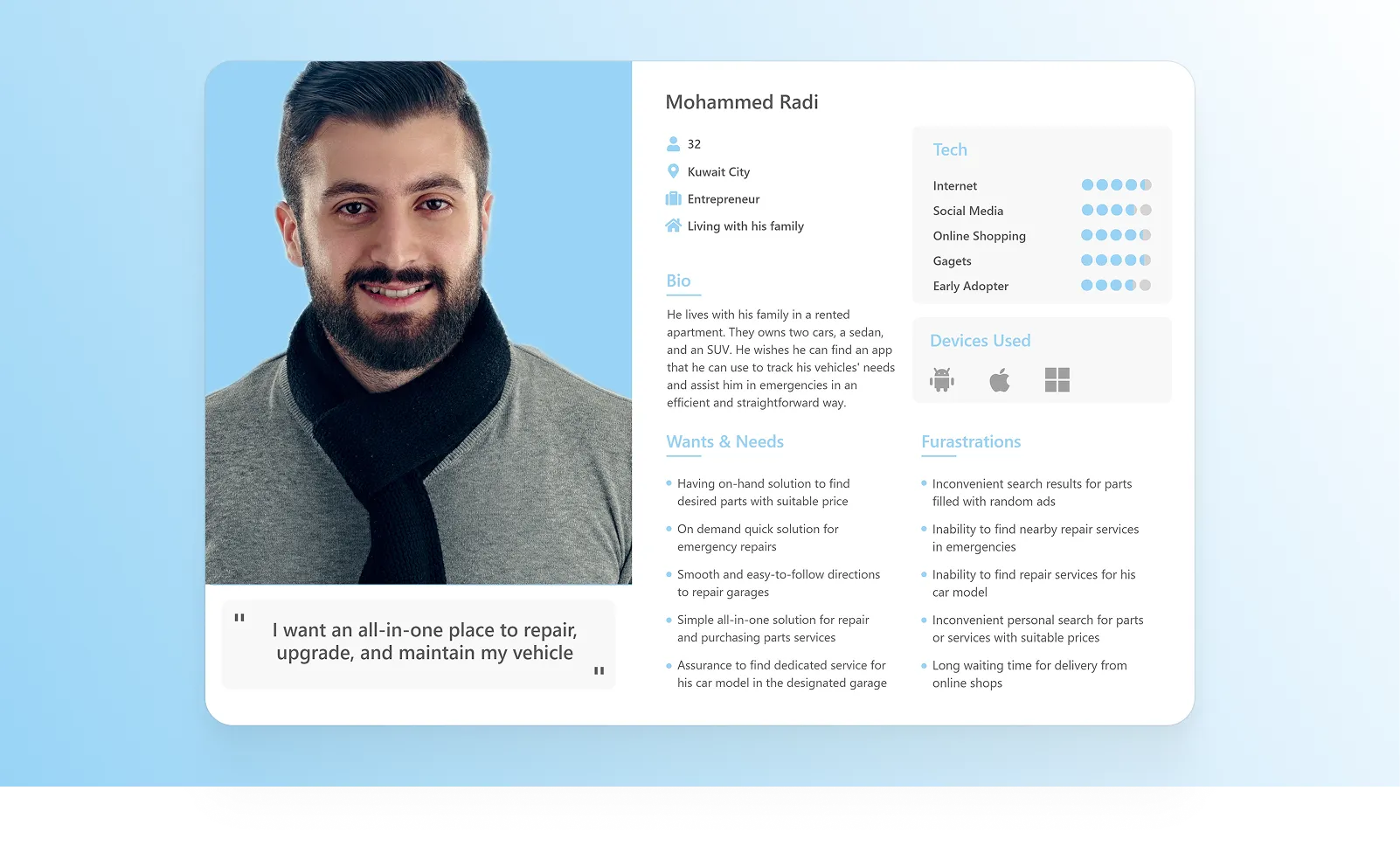
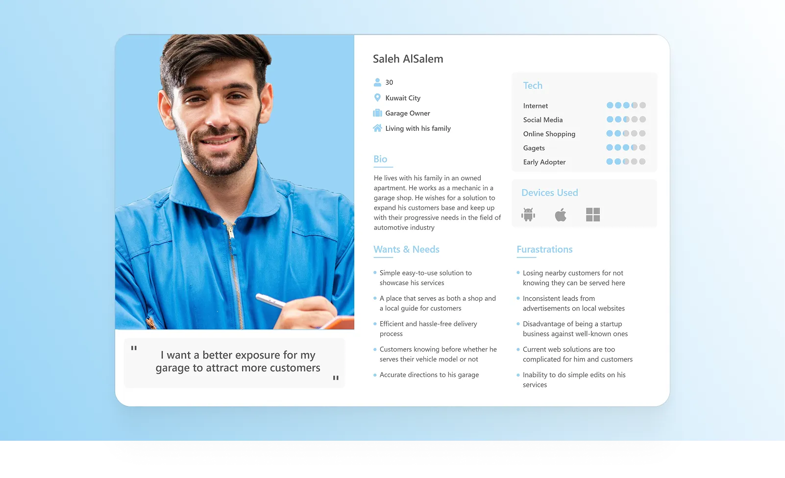
Before mapping flows and journeys, we shaped our ideas about the users in personas to guide the decisions ahead.

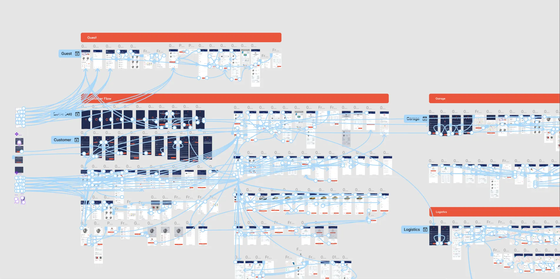
From there, we mapped the user flows with real behaviors in mind, making sure each step mirrors how people would naturally move through the product.
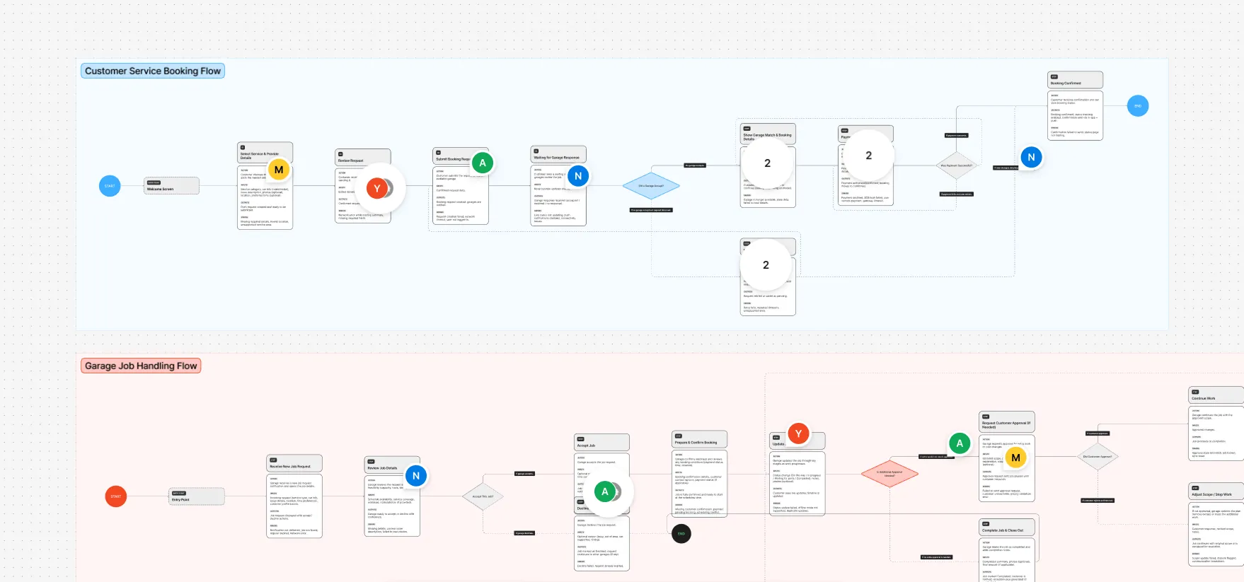
With a clearer understanding of where discovery breaks down and how coordination happens today, the next step was to shape the foundation of the product. Wireframing helped translate research into structured flows, and test how flows would actually work before focusing on visuals.
Once the initial flows were ready, we went back to our participants from the generative research to evaluate how the product actually felt in use. We walked through key scenarios together, observed where confusion happened, and gathered feedback on clarity, trust, and ease of navigation. a usability test on our initial prototype was the key to moving forward.
As expected, some ideas that worked well in theory felt different once people interacted with the product...
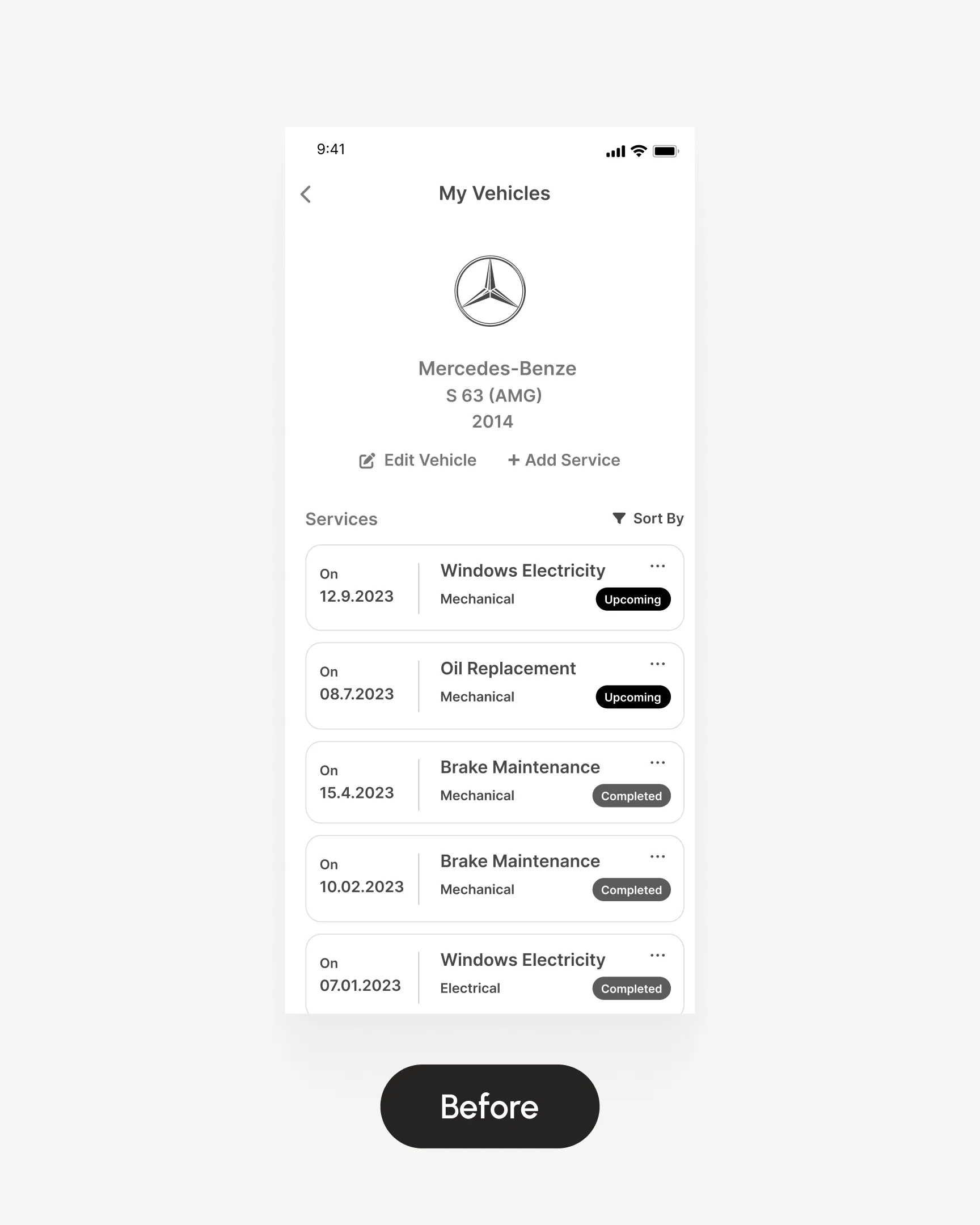
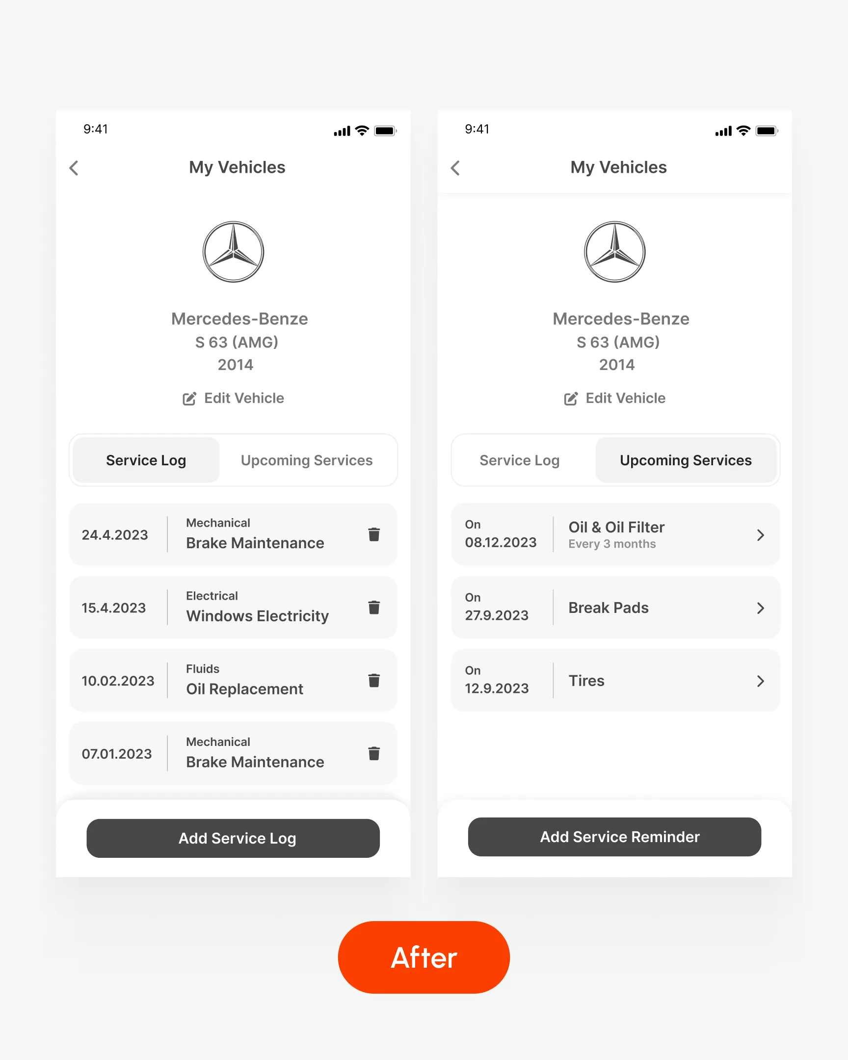
One clear example of this appeared while testing, several users struggled to understand how services were organized and how to manage them, which revealed a structural issue in the vehicle services flow that needed to be reworked:
Completed and recurring services were mixed in one list, which confused users. Managing entries required extra steps through dropdown menus.
The screen was split into Service Log and Upcoming Services. Actions became directly accessible, recurring services were clickable, and adding or deleting entries became simpler and clearer.
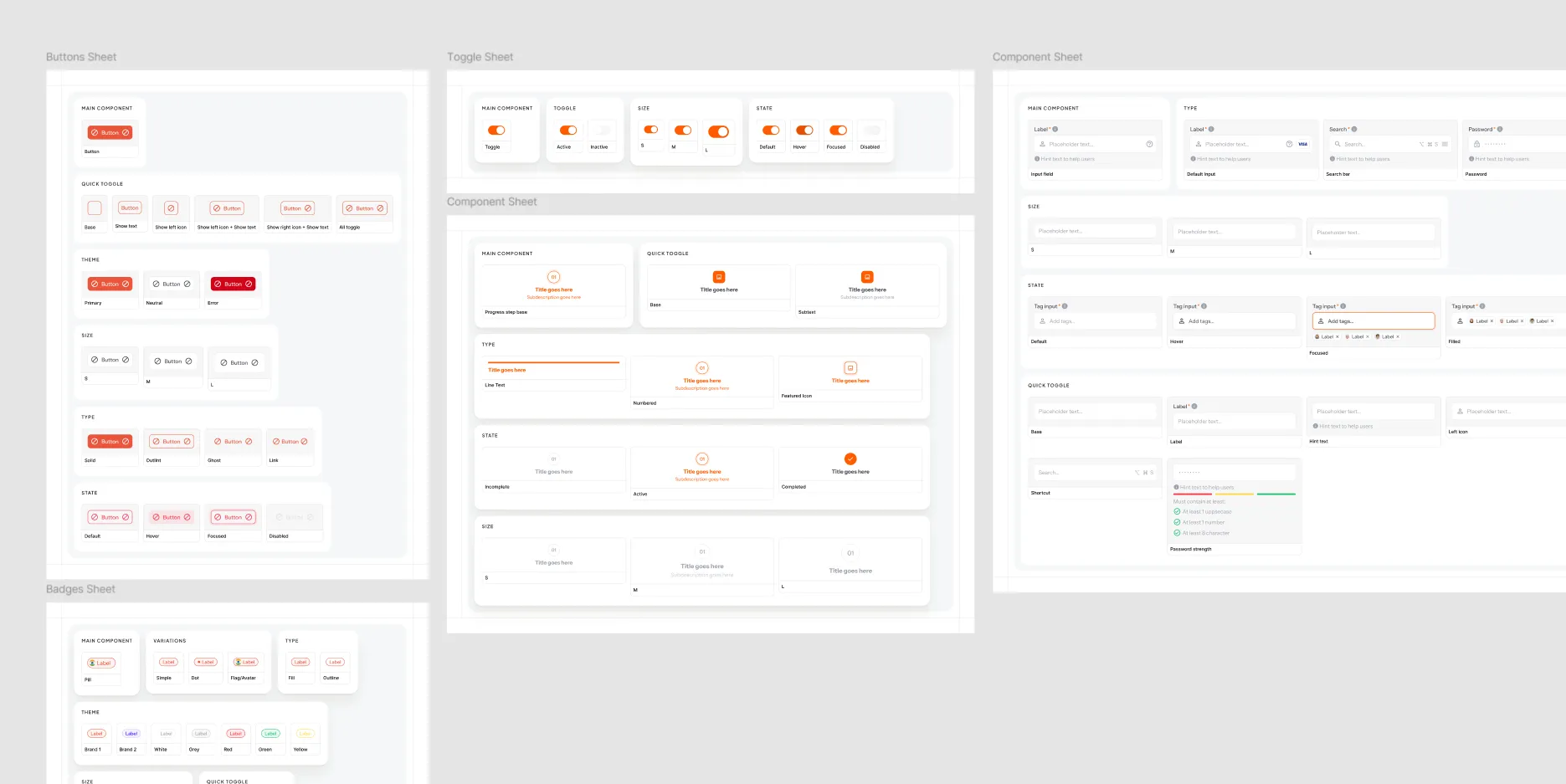
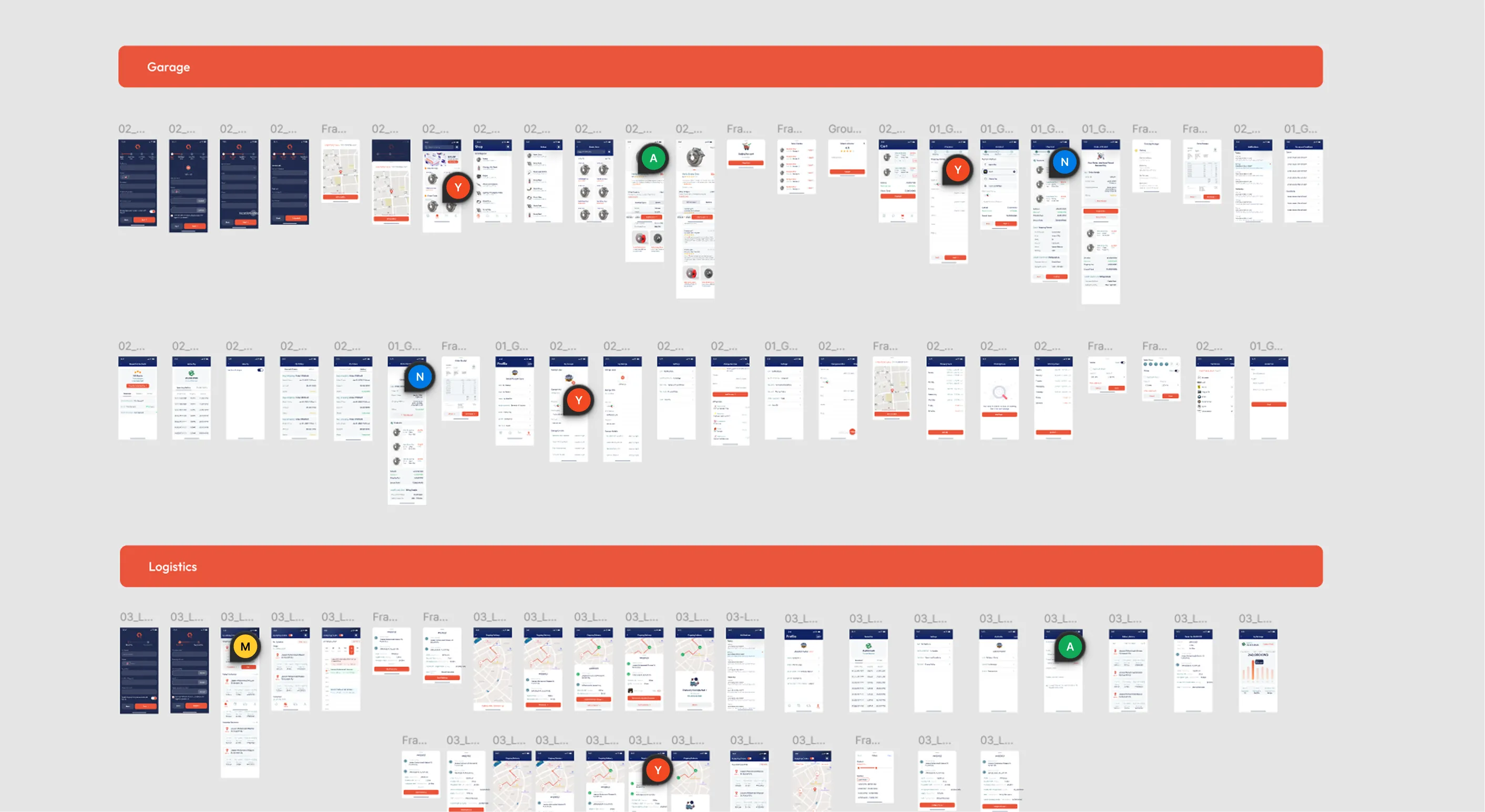
it was time to bring visual consistency to the project. We built a dedicated design system for Qetae to ensure clarity, scalability, and consistency across services, parts, and logistics experiences.
As we were building it, we made a few decisions to keep the product consistent as it grows:
- We fixed clear placement rules for actions so users don’t have to search for buttons across different screens.
- We reduced variation in layouts to avoid redesigning patterns for every new flow.
- We kept interactions straightforward and avoided overcomplicating components.

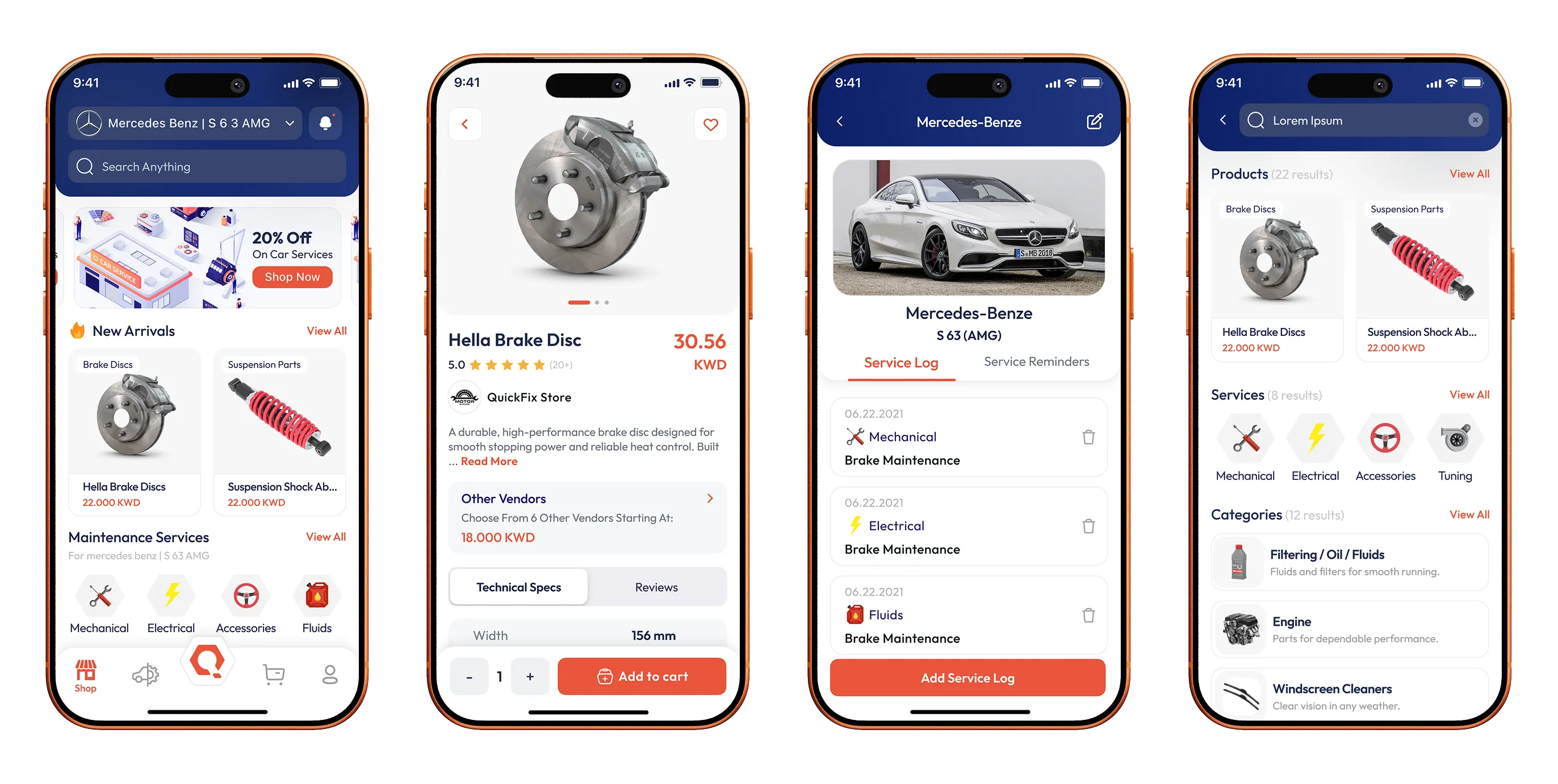
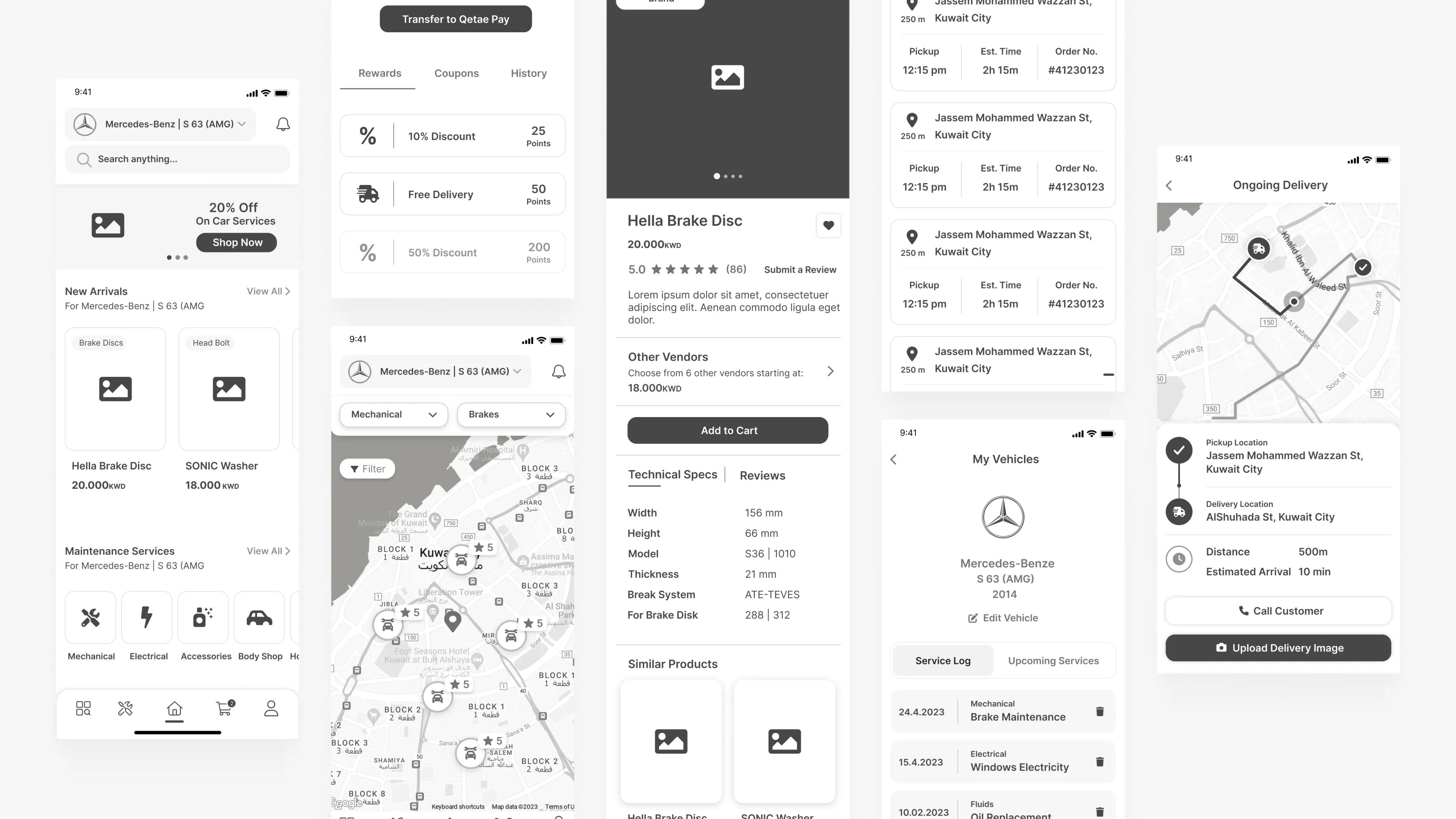
After refining the flows and locking the design system, we moved to figma to work on the high-fidelity screens. This was about making decisions final and ensuring the product felt modern, clear and consistent across every touchpoint.
Here are selected screens from the final product alongside the prototype canvas we worked on.
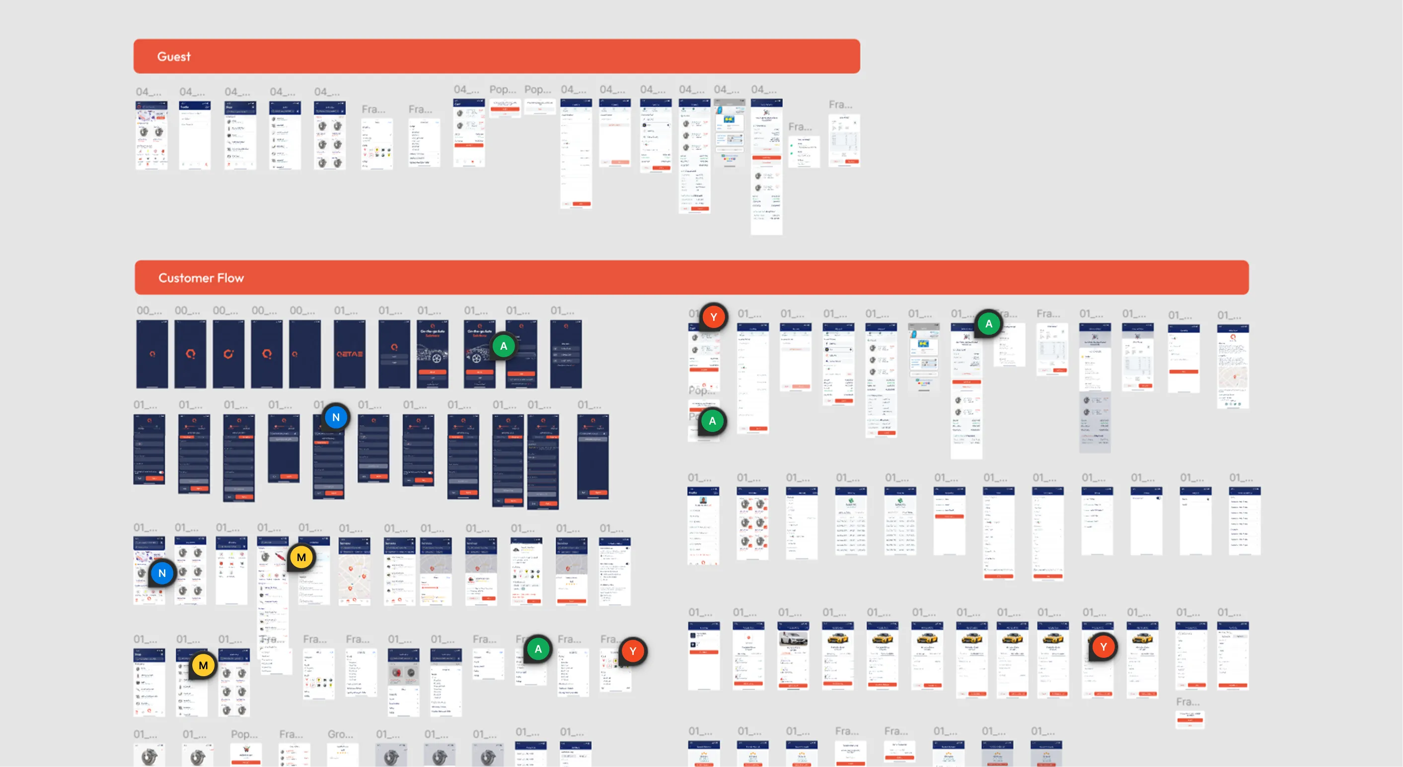

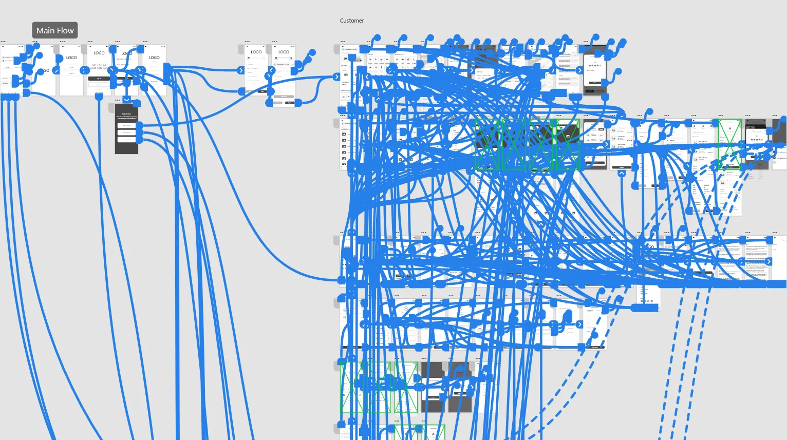
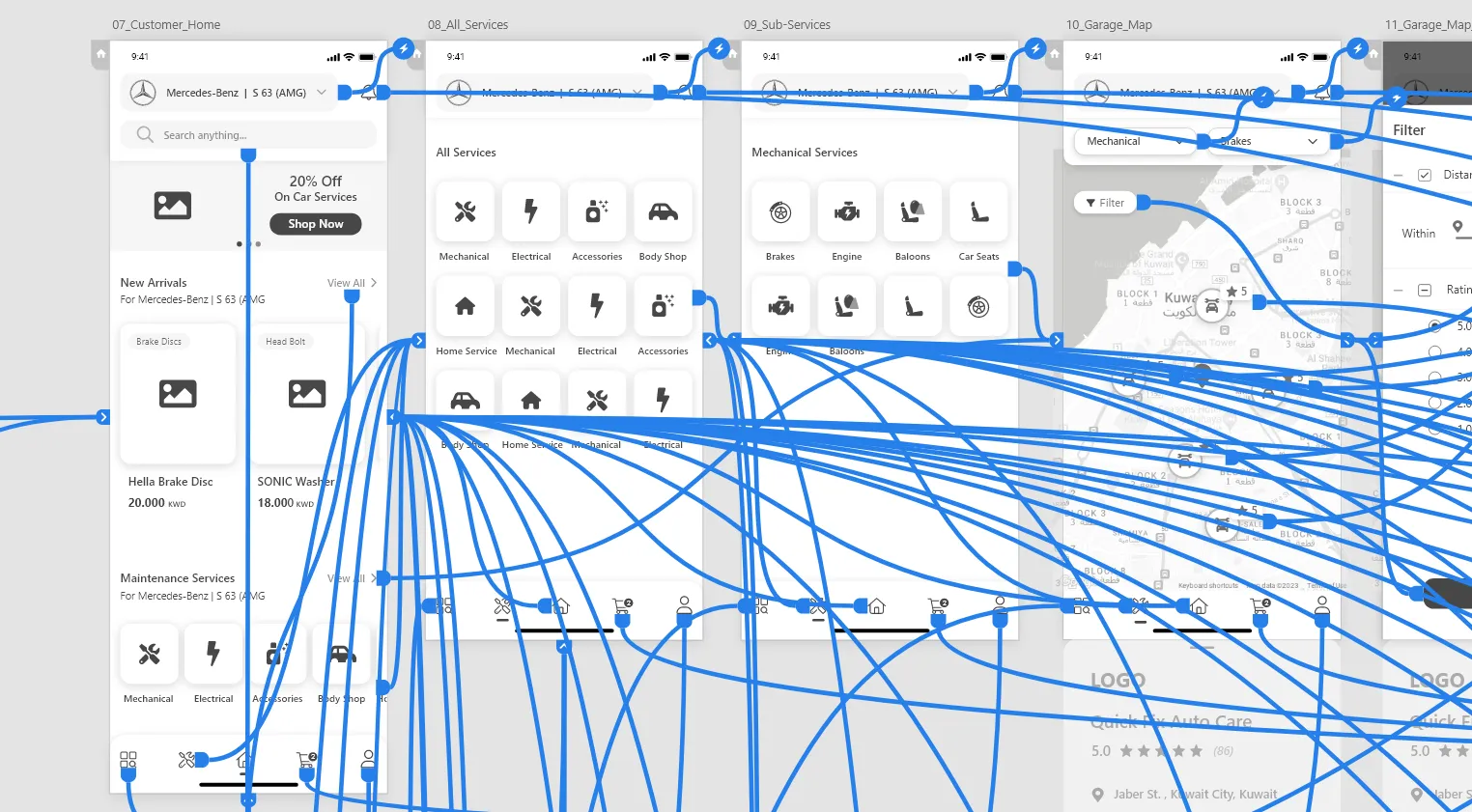
Once the high-fidelity screens were finalized, we connected them into a fully interactive prototype. Rather than reviewing isolated screens, this allowed us to experience the product as a complete journey, moving from discovery to action and confirmation.
With the full flow in place, we ran another round of usability testing to evaluate how the product performs in realistic scenarios. The focus this time was on overall clarity, decision-making moments, and how smoothly users could move through the marketplace.
With the final prototype in place, we tested the full experience end to end with the same participants involved earlier in the process. The goal was to measure how clearly users could complete key tasks and whether the product reduced the friction we initially identified.
The decisions been taken showed up clearly in how users moved through the product and completed key tasks.
And some of the results were:
of participants successfully completed a full service booking without external help.
of vehicle owners used filters or vendor comparison before confirming a service.
faster, the users reached a relevant garage or part option compared to the initial V.1 wireframe prototype testing.
of participants reported feeling confident in their final decision before checkout.
Qetae started with a simple question: why is something as common as finding a garage still so manual and outdated? Through conversations, testing, and iteration, the product slowly became clearer and more structured with every step. This project reminded me that good products aren’t built from assumptions, but from listening, refining, and testing until the experience actually works in real life.