As the sole product designer on Uni-ce, I mainly…
- Worked closely with the client and key stakeholders to understand how the platform was supposed to operate, where the product was breaking down, and what the business actually needed from it.
- Conducted interviews with end users to learn how employees were navigating the platform, where they were getting stuck, and which parts of the experience were creating confusion.
- Audited the existing designs created by the previous agency, identifying structural flaws in the product flows and resolving them before moving forward with new design decisions.
- Designed and structured the core backend modules for the platform, covering both the employee side of the product and the administrative tools used by the platform operators.
- Broke down the messy product structure and reorganized it into clear modules so the platform could actually scale as more services were added.
- Worked closely with developers to make sure the product logic and backend modules made sense and could be realistically implemented.
When we first reviewed the project, the biggest issue wasn’t the UI itself. It was the structural chaos inside the design file.
The previous agency had built the entire platform directly in high-fidelity screens without any proper foundation. There were no wireframes, no system thinking, and no shared structure agreed on with the client before jumping into final designs.
With more than 100+ screens, even the smallest change would ripple through the entire file.
Without reusable components or consistent layout structures, simple updates became painful. Changing something as basic as the navigation bar would break dozens of screens, forcing manual fixes everywhere.
There was no design system, no reusable components, and no consistent layout rules. Many screens had floating elements and inconsistent spacing, making the entire file fragile and difficult to maintain.
Because everything was built directly in high-fidelity designs, each change required reworking multiple screens instead of adjusting a structured system. What should have been a small tweak could take hours.
Without a clear process or structured iterations, feedback became chaotic. The Figma file ended up with hundreds of comments from the client’s team, reacting to every small change.
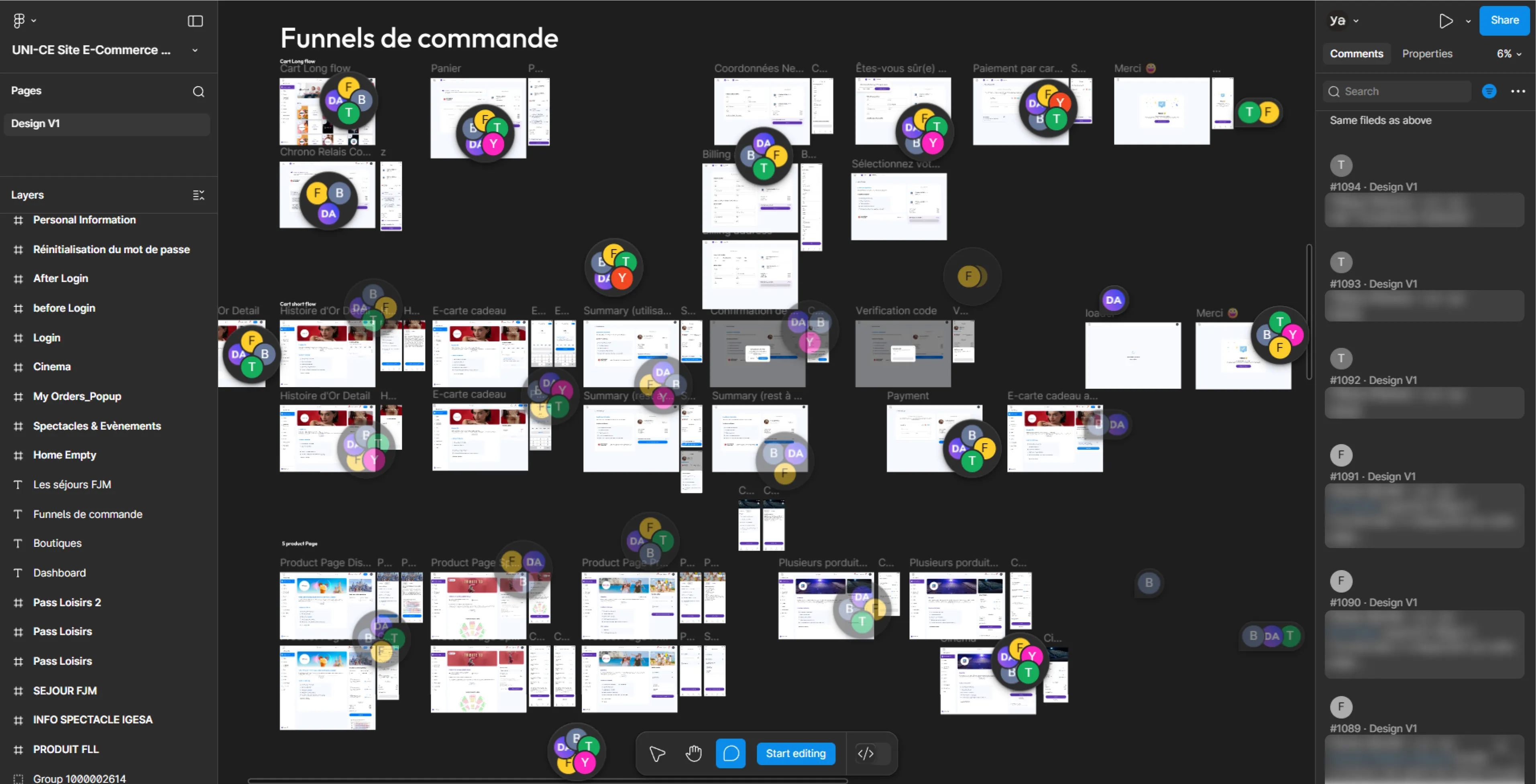
What initially looked like a messy UI turned out to be a deeper structural issue. Without a clear system, components, or process, the design file had grown into a fragile set of screens where small changes could easily break multiple flows.
The previous design process had left the client pretty frustrated. Small changes often broke parts of the design, so trust in the workflow was very low. Since the product was already built on this e-commerce platform, our focus wasn’t creating new screens but stabilizing and fixing the existing design while introducing a more structured process.
Before moving to the backend modules, the first priority was stabilizing the existing e-commerce platform design. The client had already lost confidence in the process, so the goal wasn’t redesigning everything, but making controlled improvements that fixed the most problematic areas and showed that changes could be handled in a predictable way.
- Focused on stabilizing the existing e-commerce module rather than redesigning the whole product.
- Fixed key structural issues that were breaking layouts and flows.
- Prioritized areas where developers struggled with implementation.
- Made small controlled adjustments instead of large redesigns.
- Cleaned up parts of the design to make future changes safer and easier.
- Used each iteration to show clear progress and rebuild client confidence.
- Prepared the product structure so we could move to designing the backend modules next.
About a month after stabilizing the e-commerce design, we shifted focus to the platform’s backend. The existing system already had administrative modules, but they had grown into an outdated and cluttered environment that was difficult to maintain or expand. Instead of trying to patch the old system, the decision was made to rebuild the platform structure from scratch while learning from what already existed.
Before designing new modules, we first needed to understand how the current platform actually worked and what the teams operating it needed on a daily basis.
- Reviewed the existing backend platform to understand how the current modules operated.
- Identified pain points and limitations in the old system’s structure and workflows.
- Mapped how different administrative functions were handled across the platform.
- Conducted interviews with key project stakeholders to understand operational needs.
- Gathered insights on where the platform was slowing teams down and where improvements were most needed.
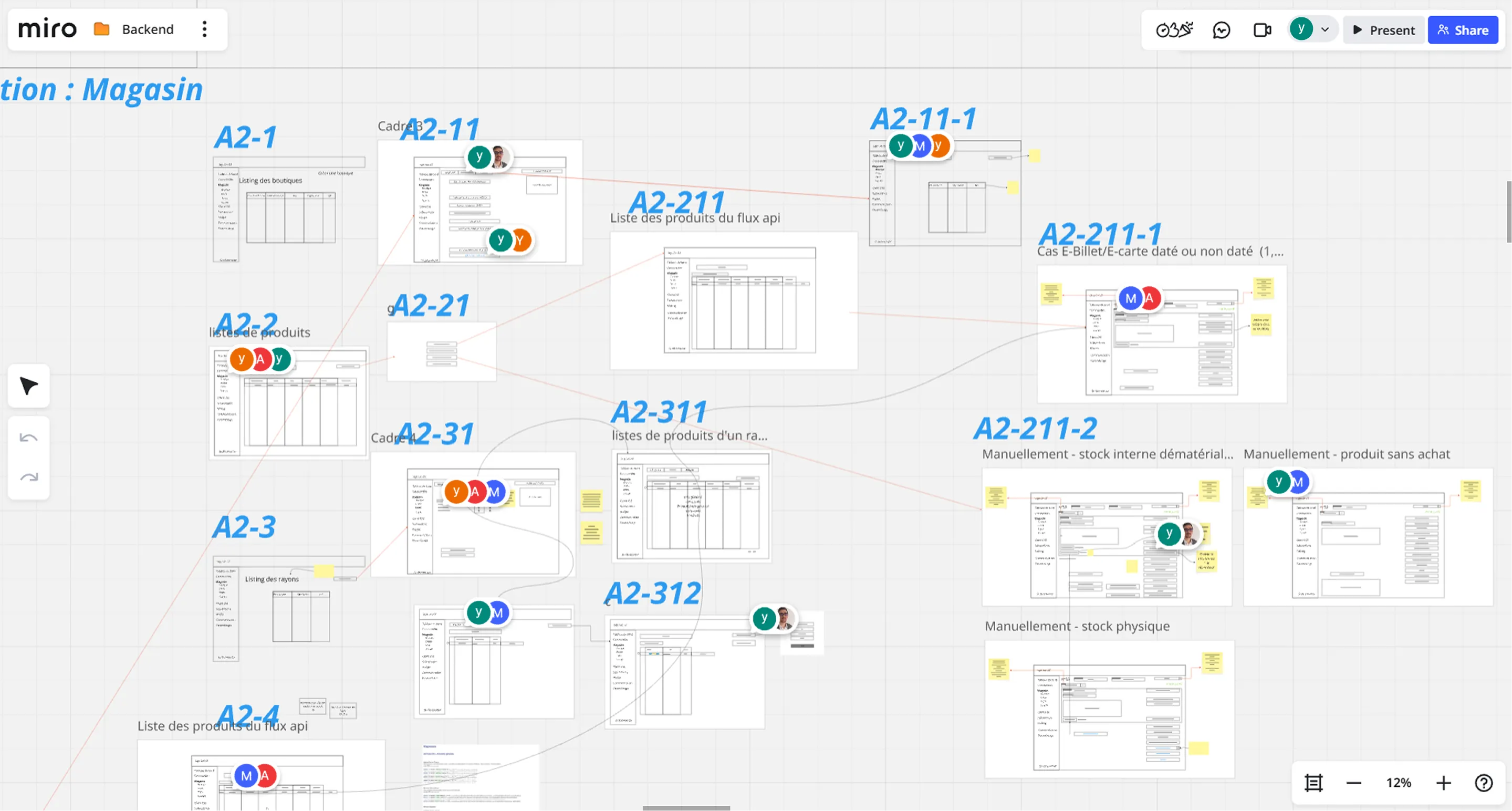
We conducted multiple workshops to review the current Users module and map out its main issues, creating boards for each main section to capture the key observations and insights that will guide the redesign.
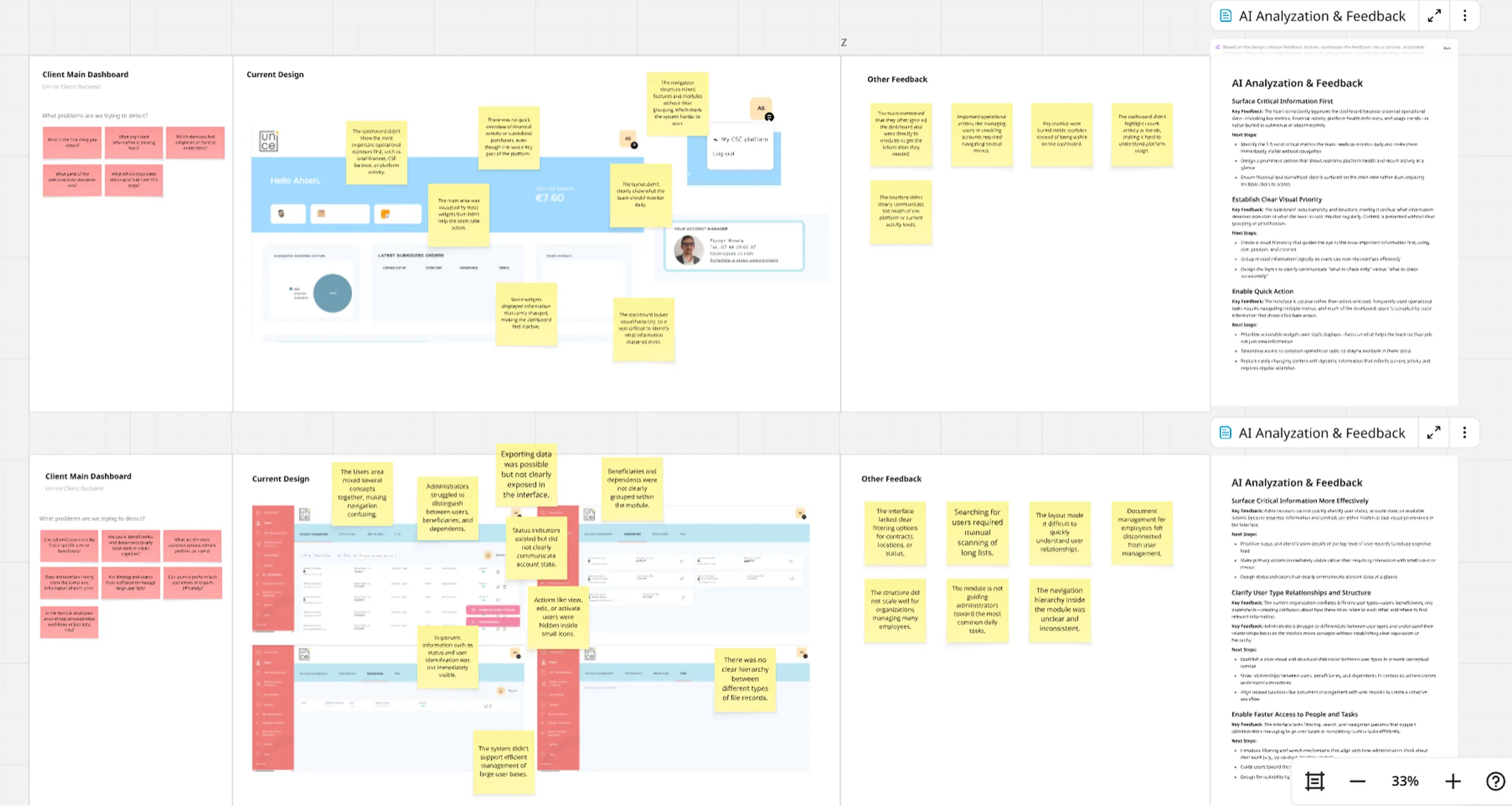
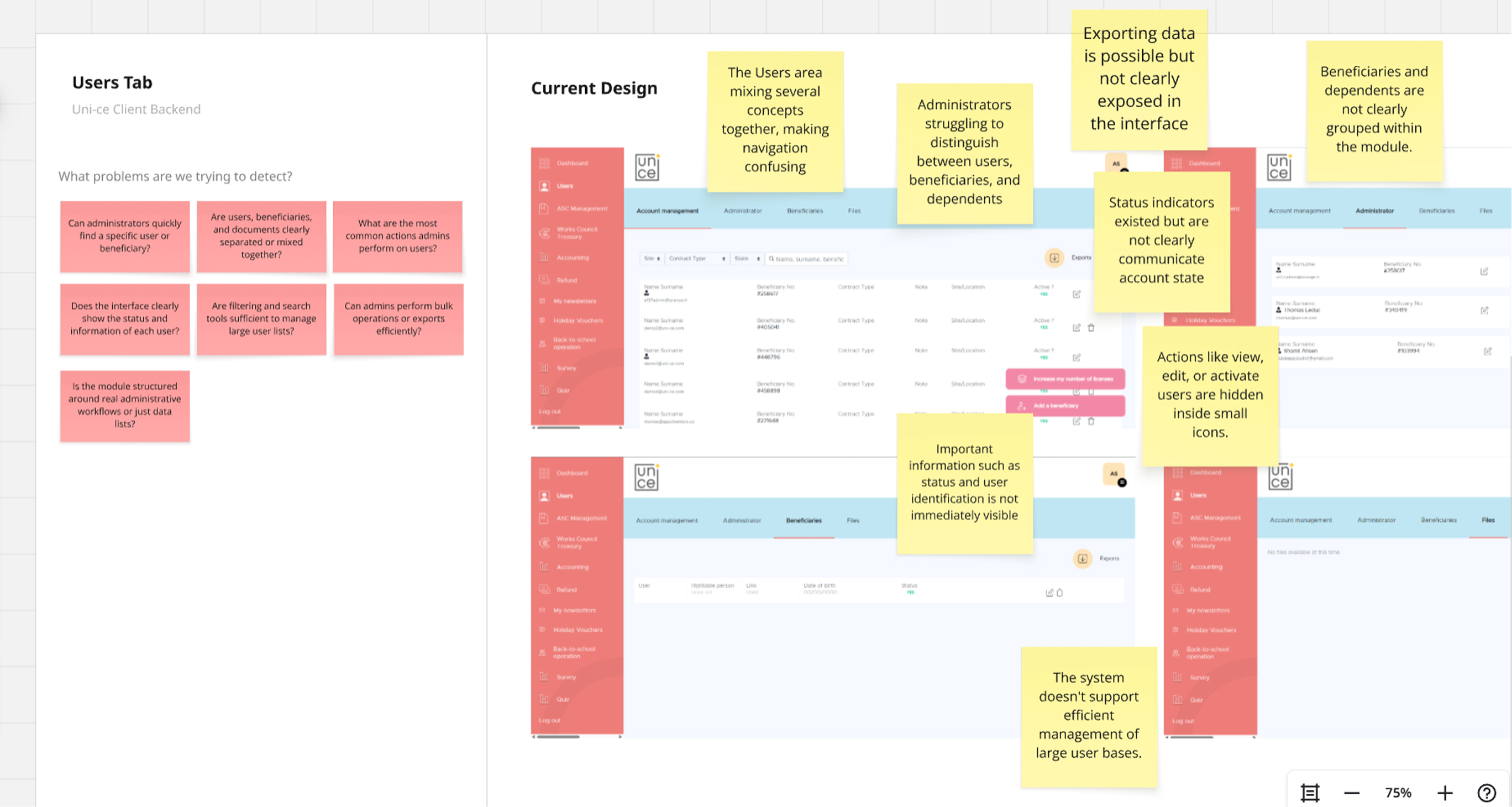
At this point, we stopped trying to fix things screen by screen and stepped back. The backend was messy, and everyone had a slightly different idea of how it should work. So instead of guessing, we brought people together and started sketching it out properly, from scratch, but in a rough and fast way.
We used Miro to keep things simple and collaborative. Nothing polished, just enough to think clearly and move fast.
- Ran 5 workshops with stakeholders and 2 actual users
- Sketched all main backend modules and key screens together
- Worked directly on flows, not isolated screens
- Kept everything low-fi so ideas stayed flexible
- Used Miro to make it easy for everyone to jump in and react
- Spotted gaps and messy logic early, before going into design
- Aligned on a clear structure we can build on later
This was the moment things started to click. Instead of fixing chaos, we finally had something solid to move forward with.
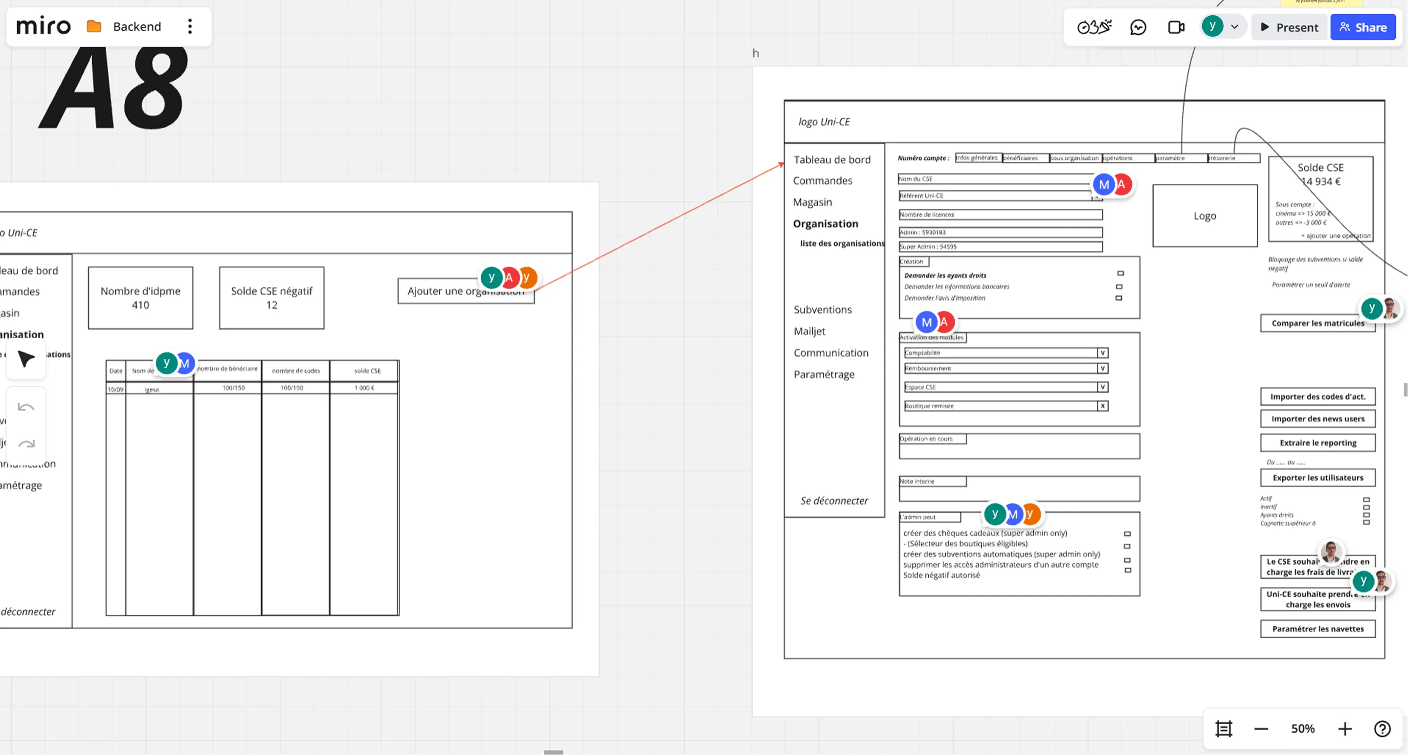
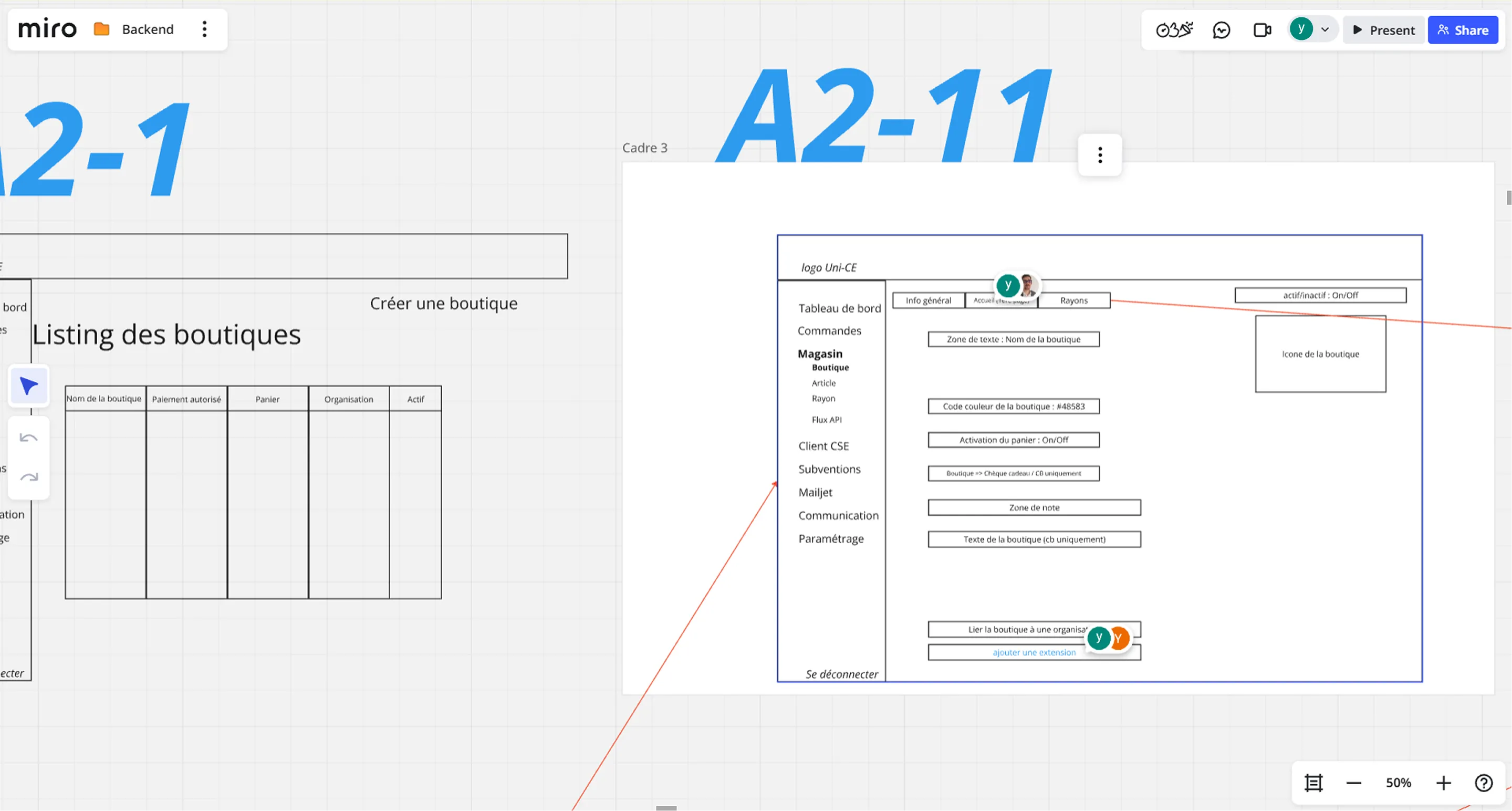
After several workshops, the product started to take shape. We had clearer flows, aligned ideas, and a structure that actually made sense for the backend.
As part of the process, the next step was to make clear decisions around the design system. This would become the foundation for all high-fidelity designs from now on.
At this stage, we knew clearly that the product couldn’t move forward without a proper design system. The issues we faced in the e-commerce module made that obvious: no consistency, no hierarchy, and no scalability. The ideal approach would have been to build a fully custom system from scratch, but given the tight timeline and limited development budget, that wasn’t realistic for this project.
So instead of forcing a custom solution, I made a more practical decision: use an existing system that could give us structure quickly without slowing the team down.
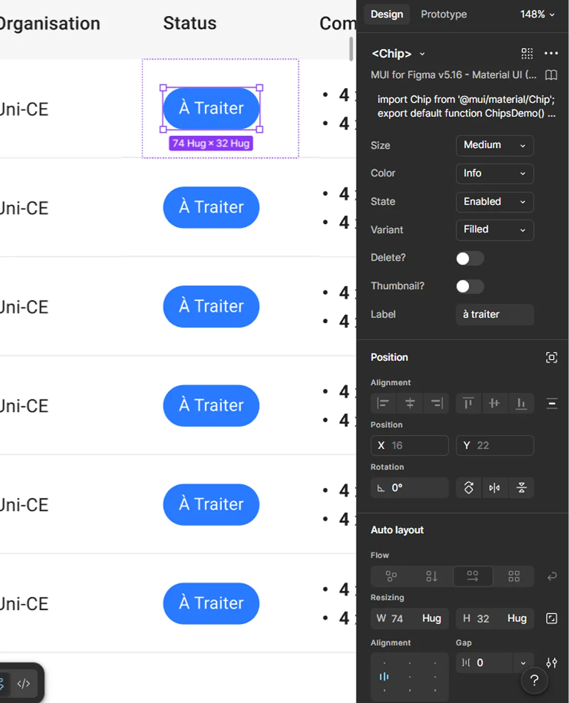
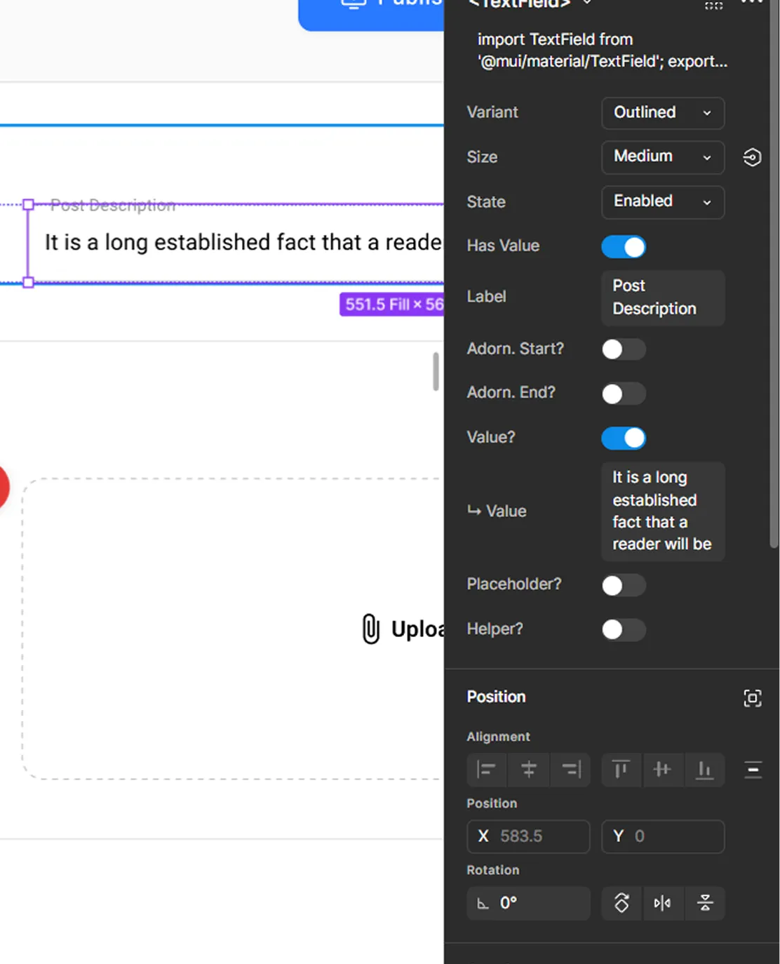
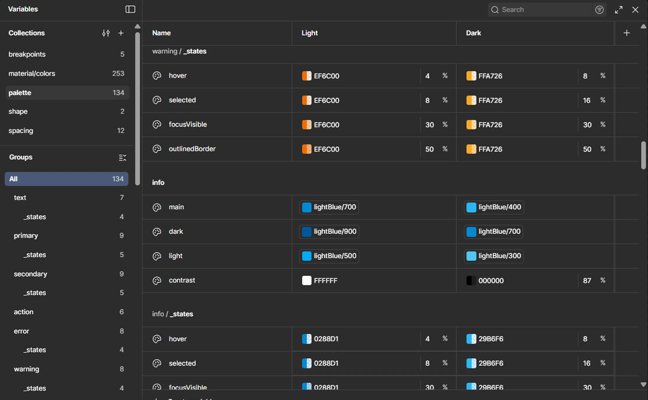
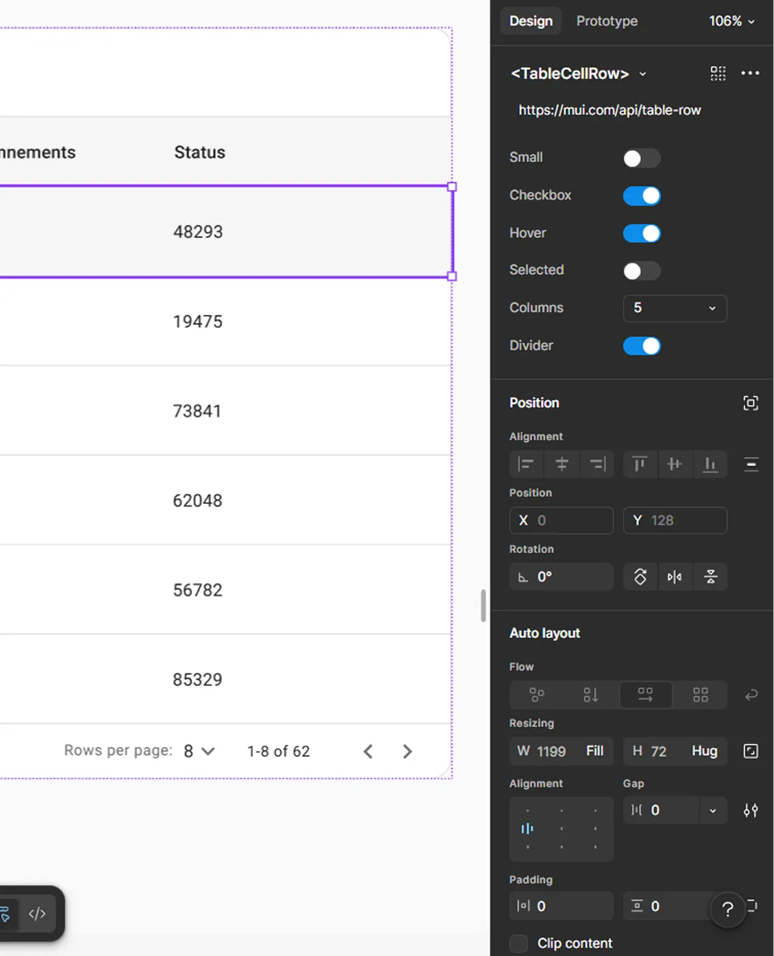
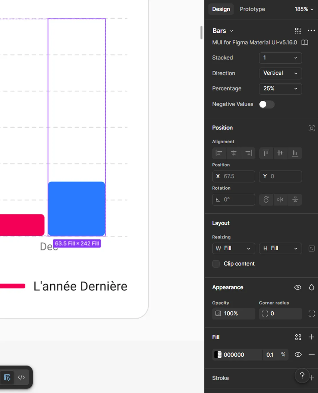
After evaluating the options, I suggested moving forward with MUI (Material UI) Design System as the base for the hi-fi design. That was because MUI:
- Comes with a ready-to-use component library, which saved a lot of time
- Provides built-in consistency and structure across all modules
- Makes it easier for developers to implement and maintain designs
- Supports scalability, allowing us to extend components when needed
- Well-documented and widely used, which reduces development friction
- Flexible enough to customize and match the product needs without starting from zero
- Helps avoid falling back into the same unstructured design issues we had before
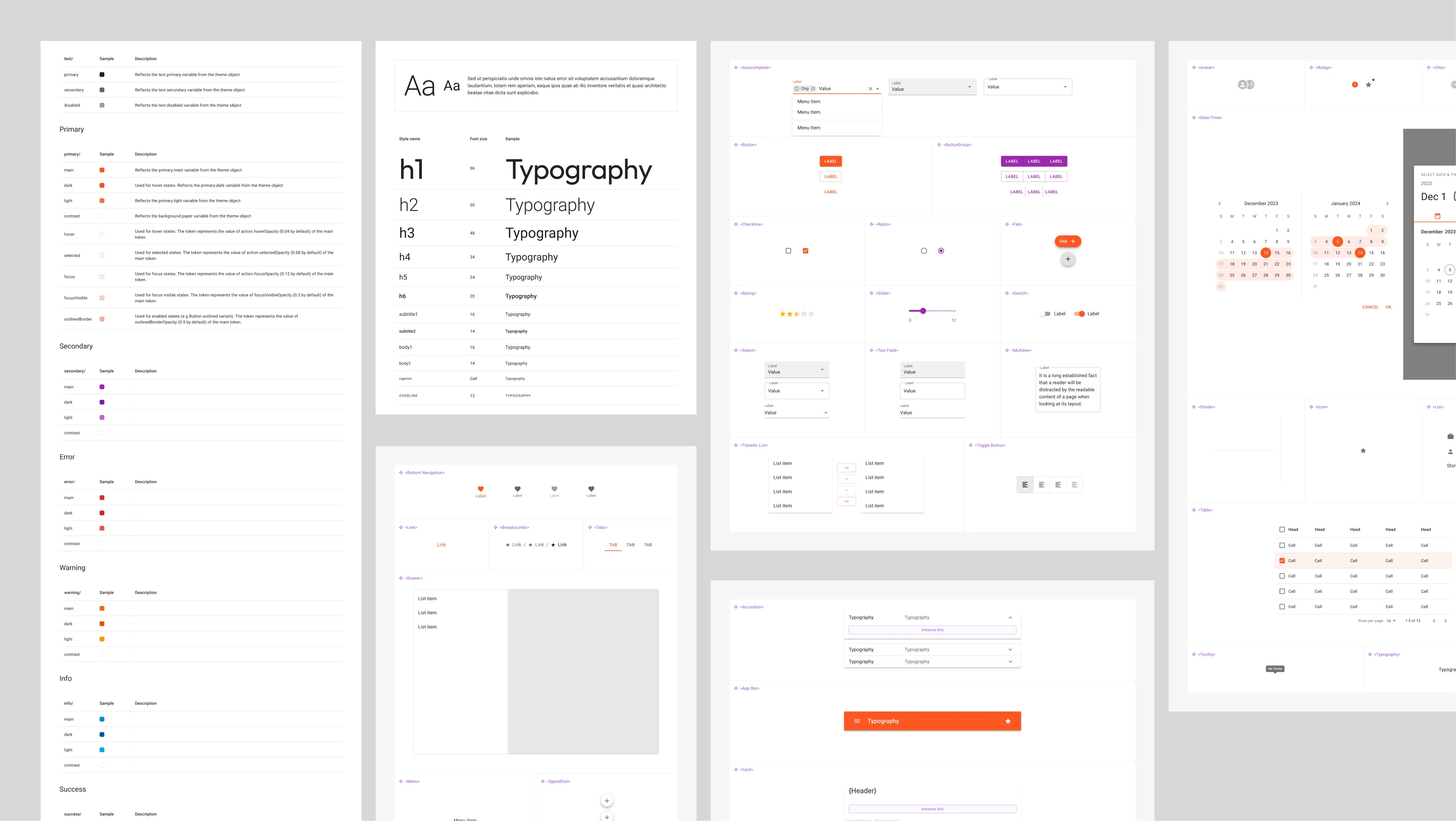
From my side, having worked with design systems before, both in design and development environments, made this decision much more straightforward. I knew how MUI behaves in real projects, how teams work with it, and how to adapt it without breaking consistency.
That experience helped ensure we were making a decision that fit both the business constraints (time and budget) and the product goals (scalability and structure), while setting a solid foundation for everything that would come next.
With the design system in place, things finally felt under control. We had structure, components, and a clear way to build.
From here, we moved into the first round of UI design and started turning everything into real screens.
With the structure, flows, and design system in place, designing the backend UI became much more straightforward. It was no longer about figuring things out.
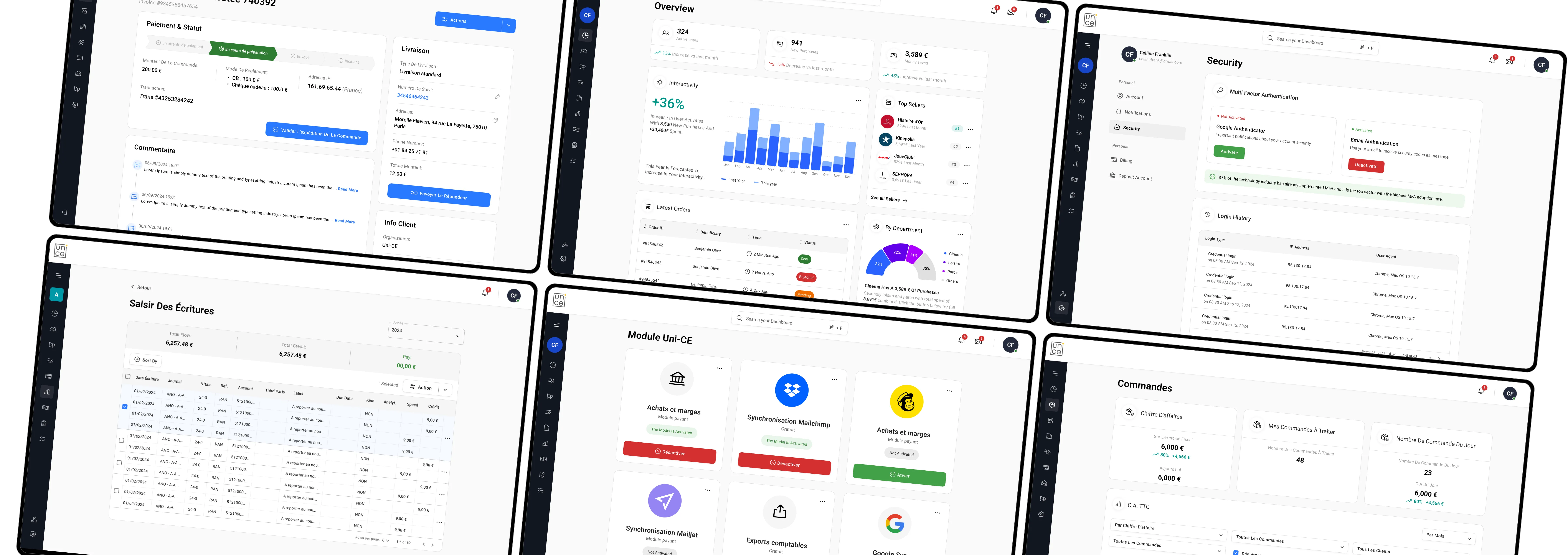
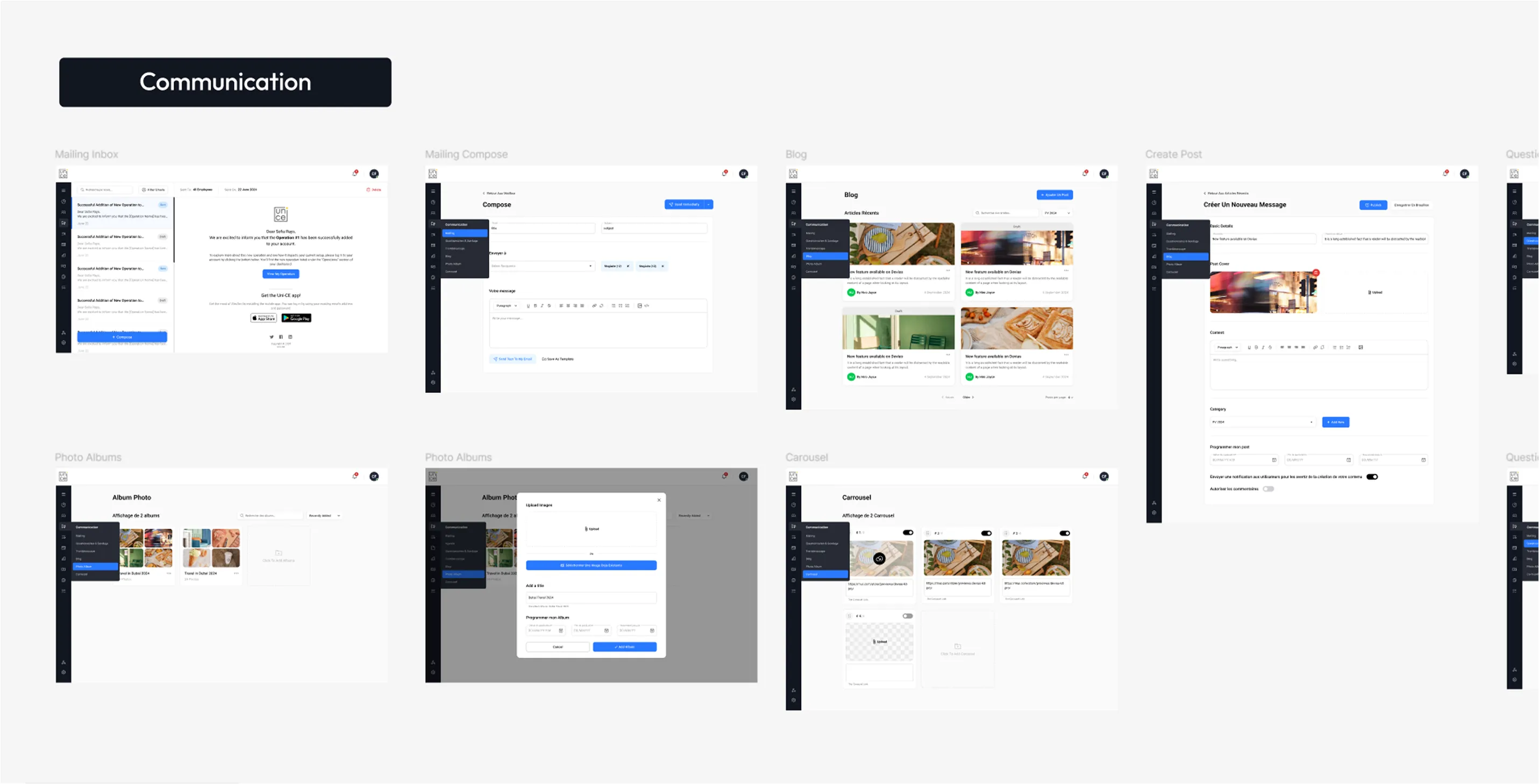
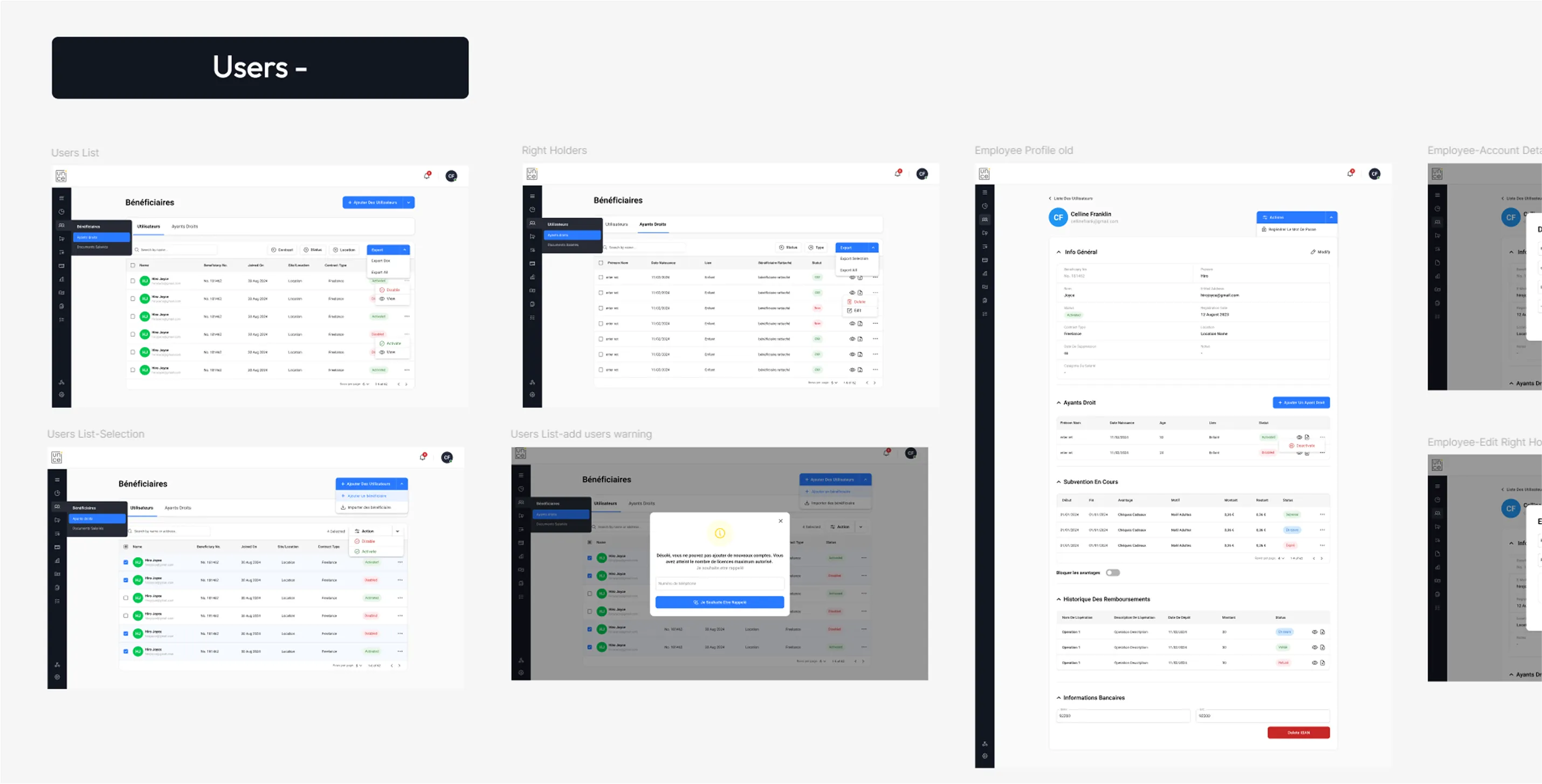
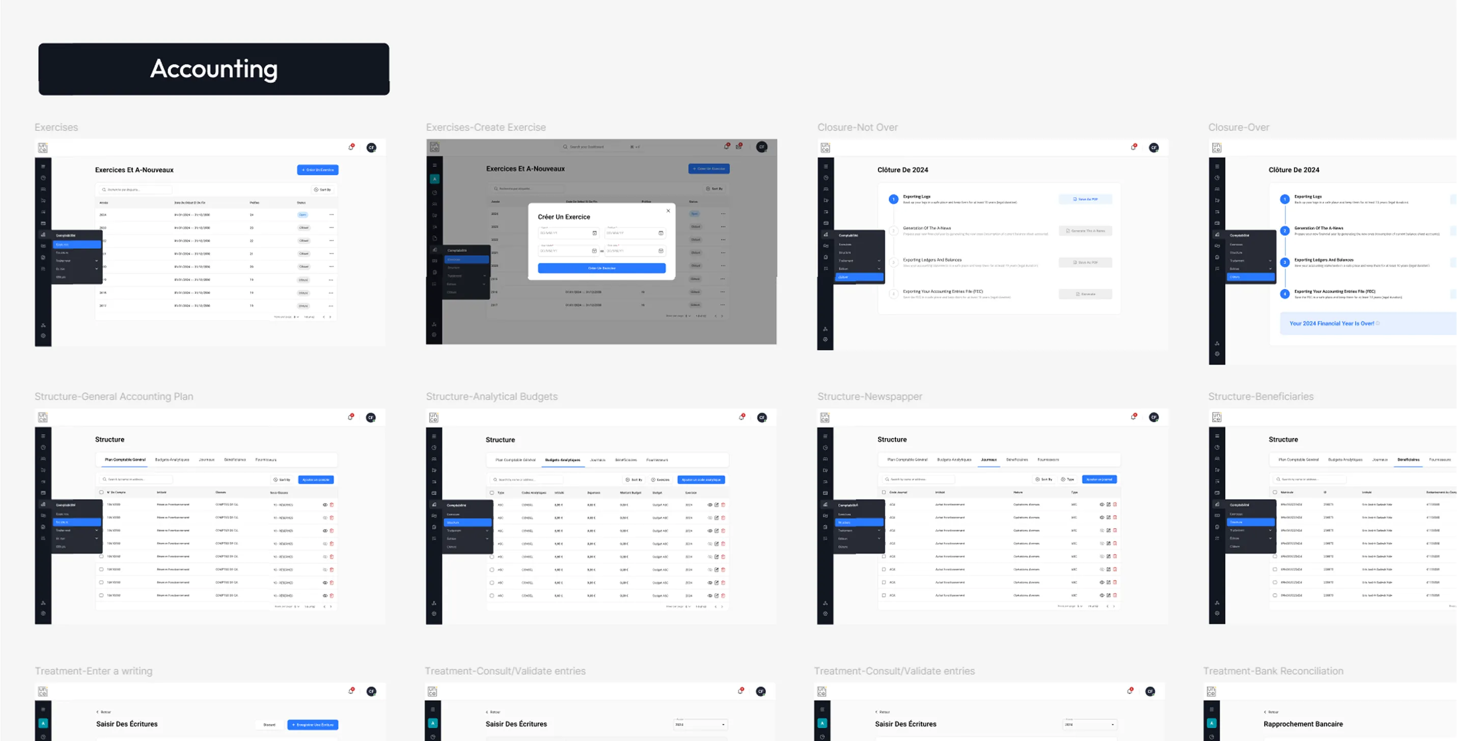
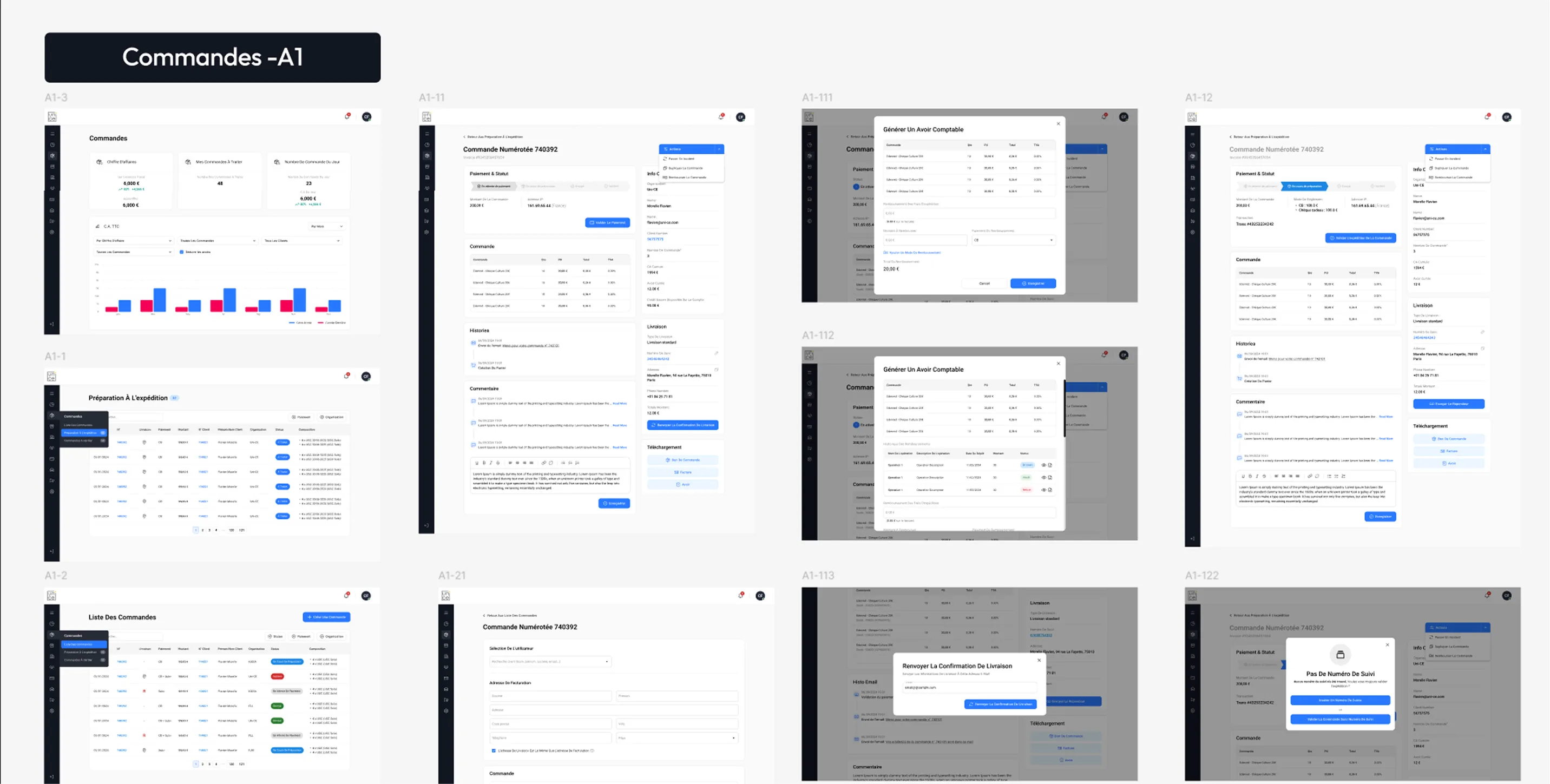
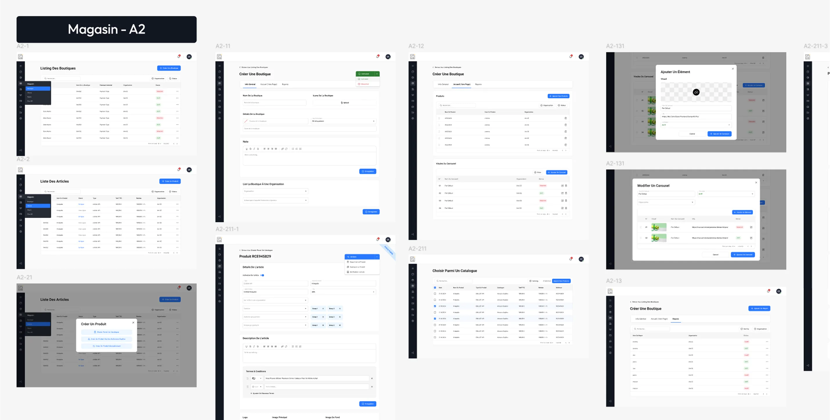
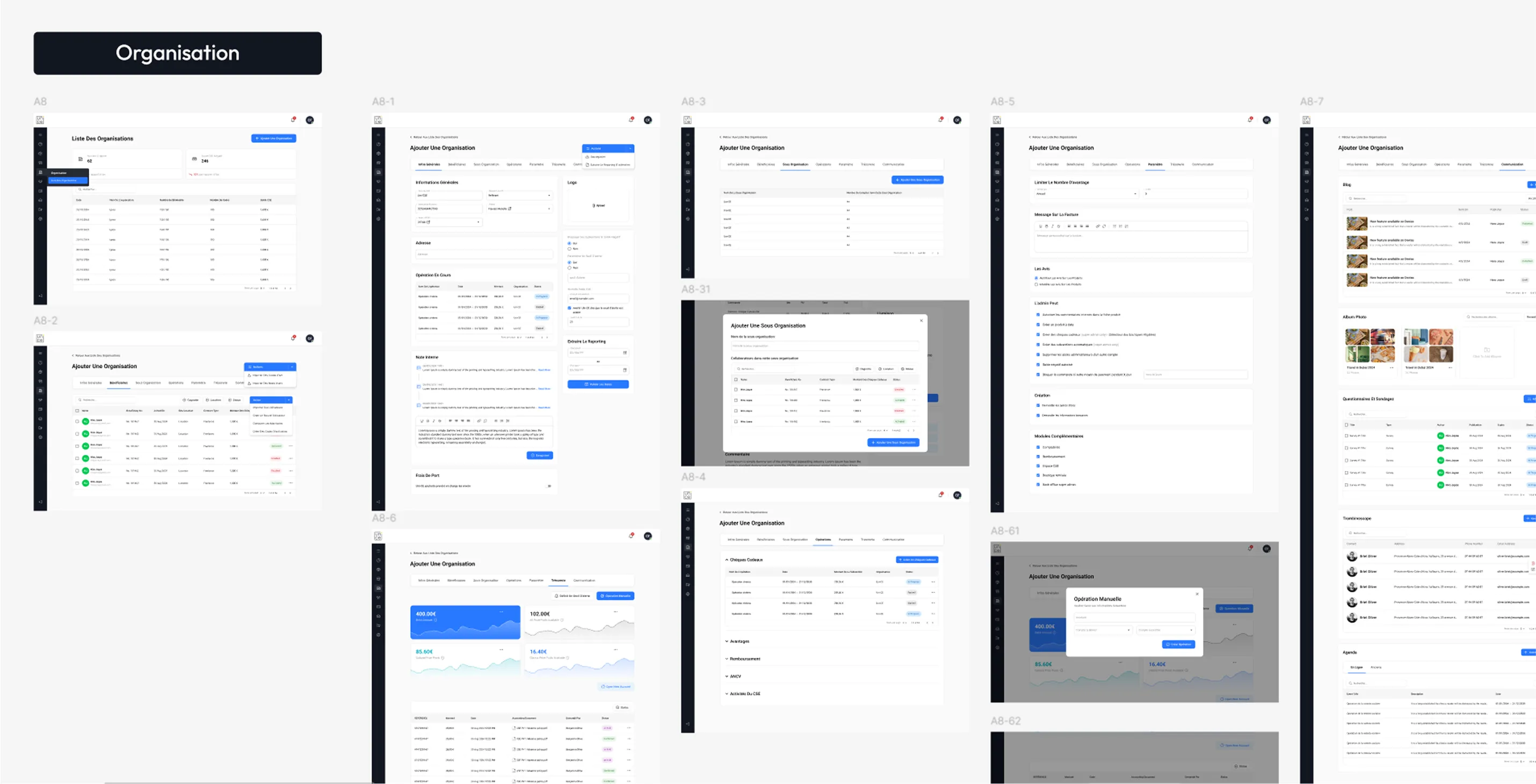
As shown across the platform screens , the backend covers a wide range of modules, from user management and beneficiaries to accounting, operations, and communication.
- Designed the backend as a control center for managing all employee benefits
- Built on top of the existing e-commerce logic and structure
- Applied the design system to ensure consistency across all modules
- Structured modules like users, budgets, operations, and communication
- Made sure each section reflects real workflows used by companies
- Translated complex processes into clear, manageable interfaces
Because the foundation was already strong, this phase felt less like solving problems and more like assembling something that makes sense.
Before moving on to the super admin platform, we tested what we had built. We ran a few workshop sessions with two of the platform's future clients and the project stakeholders to see how the platform holds up in real use.
The feedback helped us spot a few gaps and make quick adjustments, making sure we were moving in the right direction before scaling further.
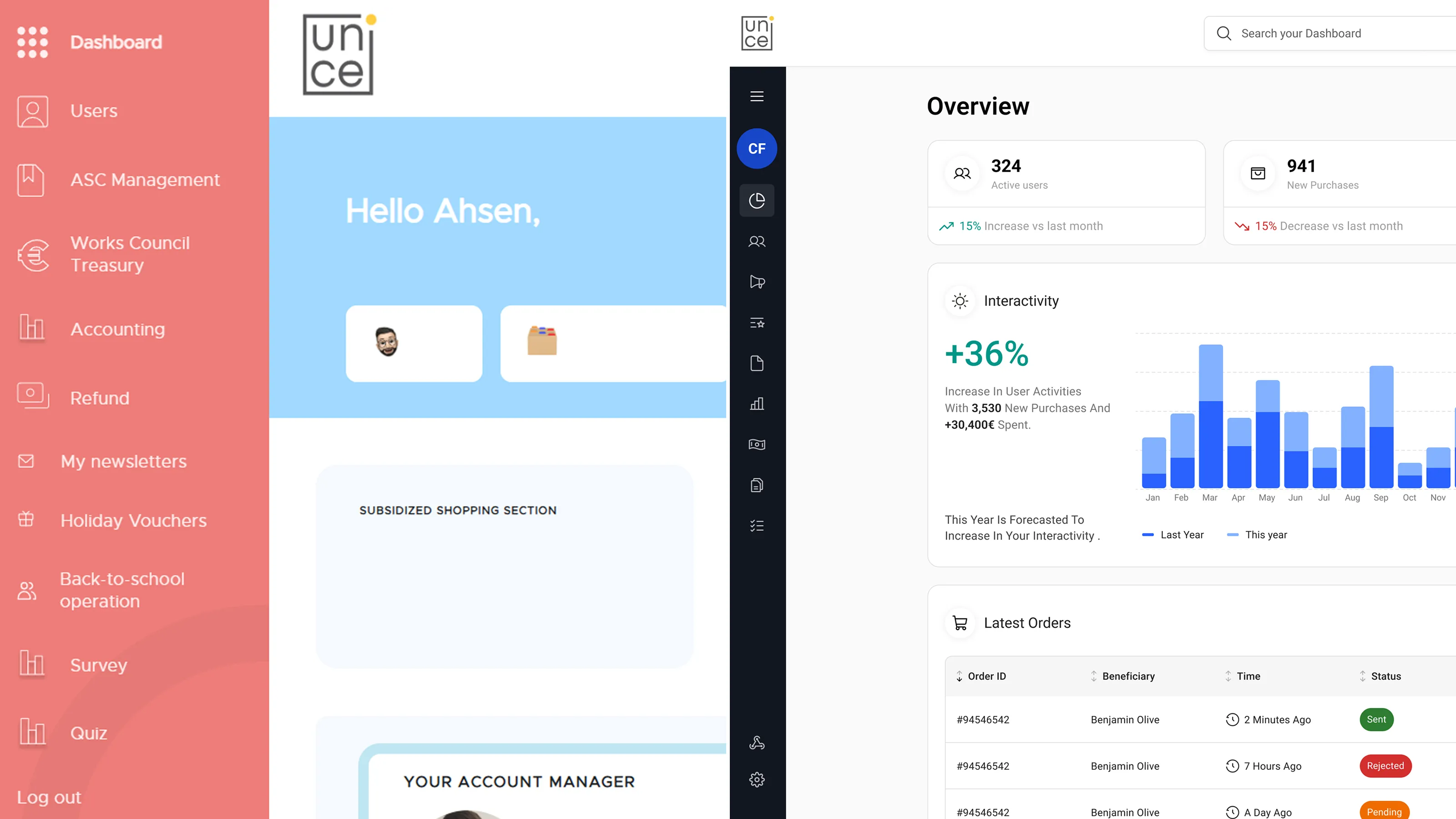
This is where things really scale. The super admin platform sits on top of everything, giving Uni-CE full control over clients, operations, and the entire system.
Unlike the client backend, this wasn’t about managing one company. It was about managing all of them at once. Focusing on:
- Seeing all client organizations clearly in one place
- Managing shops, products, and catalogs across clients
- Following orders from creation to delivery
- Handling beneficiaries across different organizations
- Making support tasks like refunds and fixes quick and easy
- Turning complex data into simple, readable tables
- Adding strong filters and search to handle large data
- Keeping the experience consistent with the client backend
- Supporting bulk actions where needed
- Designing for scale from day one
Everything from orders and analytics to organizations and products is connected in one system.
With both the client backend and the admin platform in place, the product finally came together as one complete system.
From here, it was worth looking at what that shift meant in practice, and how it impacted the product and the people who will be using it.
Once everything was in place, the difference wasn’t just visuals only , it showed up in how fast the team could work, how stable the product became, and how people felt using it.
We tested the new platform with the future clients and the stakeholders and conducted two surveys comparing it to the old one to see how much it actually improved.
With both the client backend and the admin platform in place, the product finally came together as one complete system.
From here, it’s worth looking at what that shift meant in practice, and how it impacted the product and the people using it.
Screens e were able to design and ship, across multiple modules without things breaking or becoming inconsistent.
Based on dev team feedback, handoff became much smoother with fewer blockers and way less time wasted guessing.
Users reported a big jump in ease of use compared to the old platform.
Fewer revisions and comments between stakeholders, design, and development.
In the end, this wasn’t just about fixing a messy design file. It changed how the product is built, how both our design team and their development team collaborated, and how the platform can grow going forward.